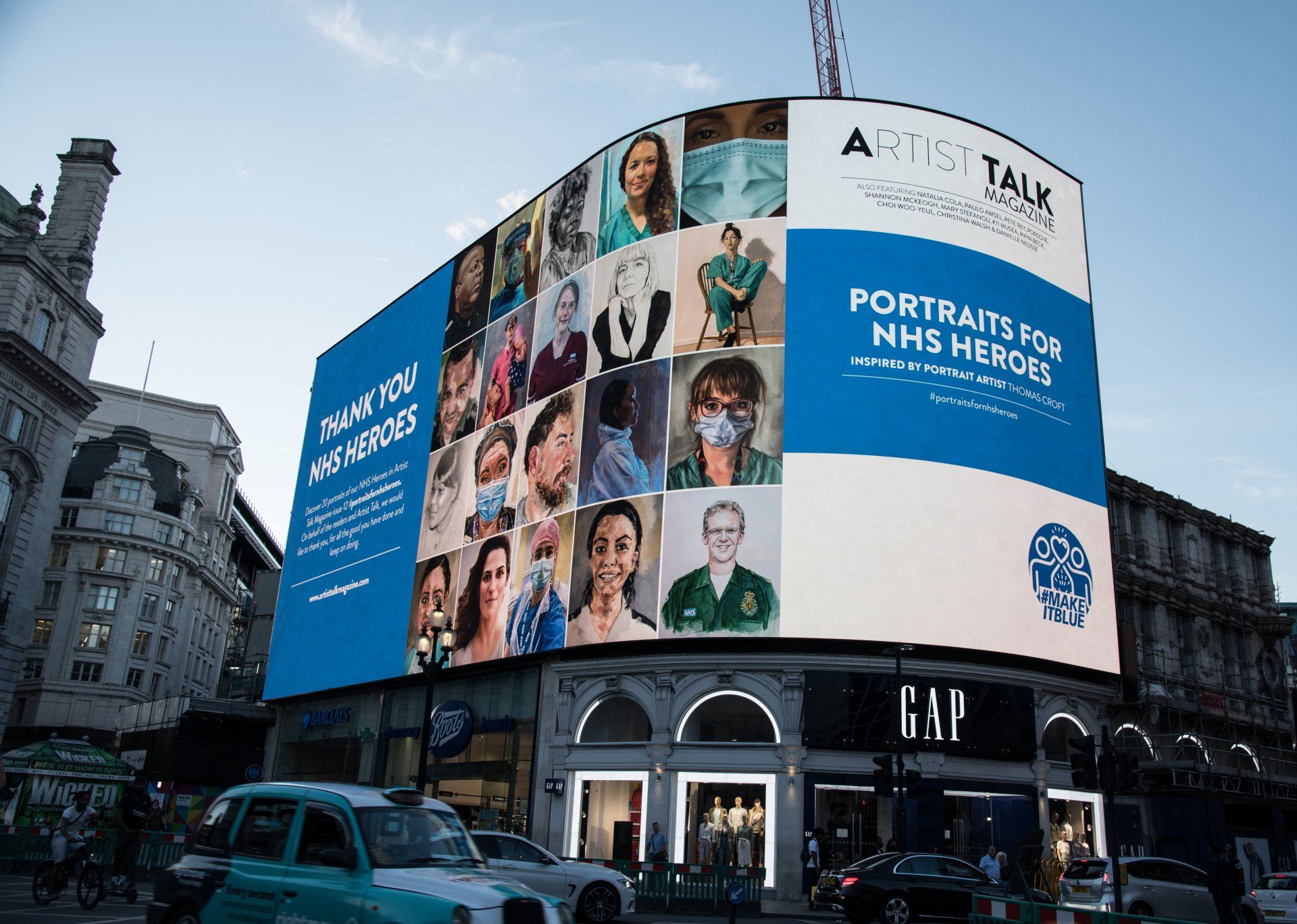
ISSUE 20 - ONLINE GALLERY
(Please note all images are shown in square format. Therefore some areas of the artwork have been cropped. Please click on image to view the correct dimensions)
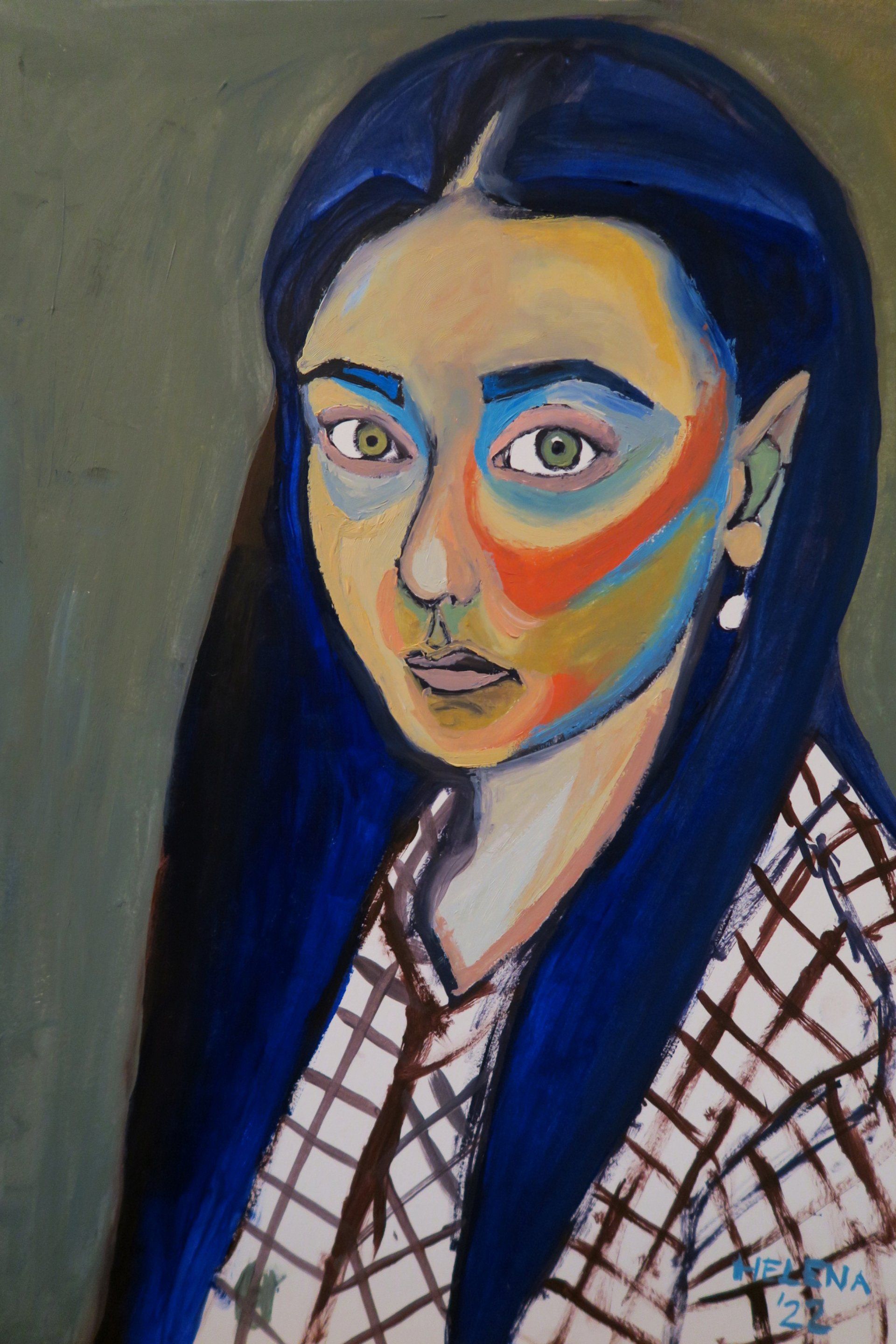
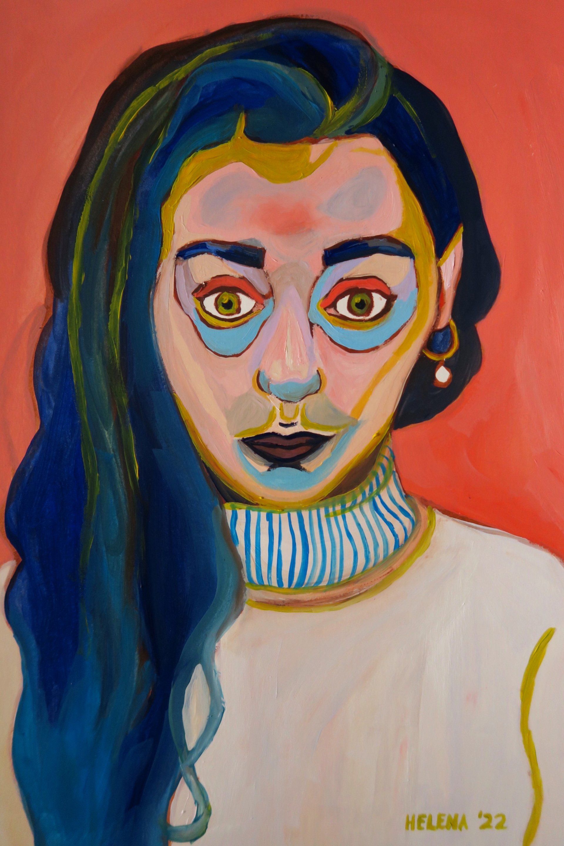
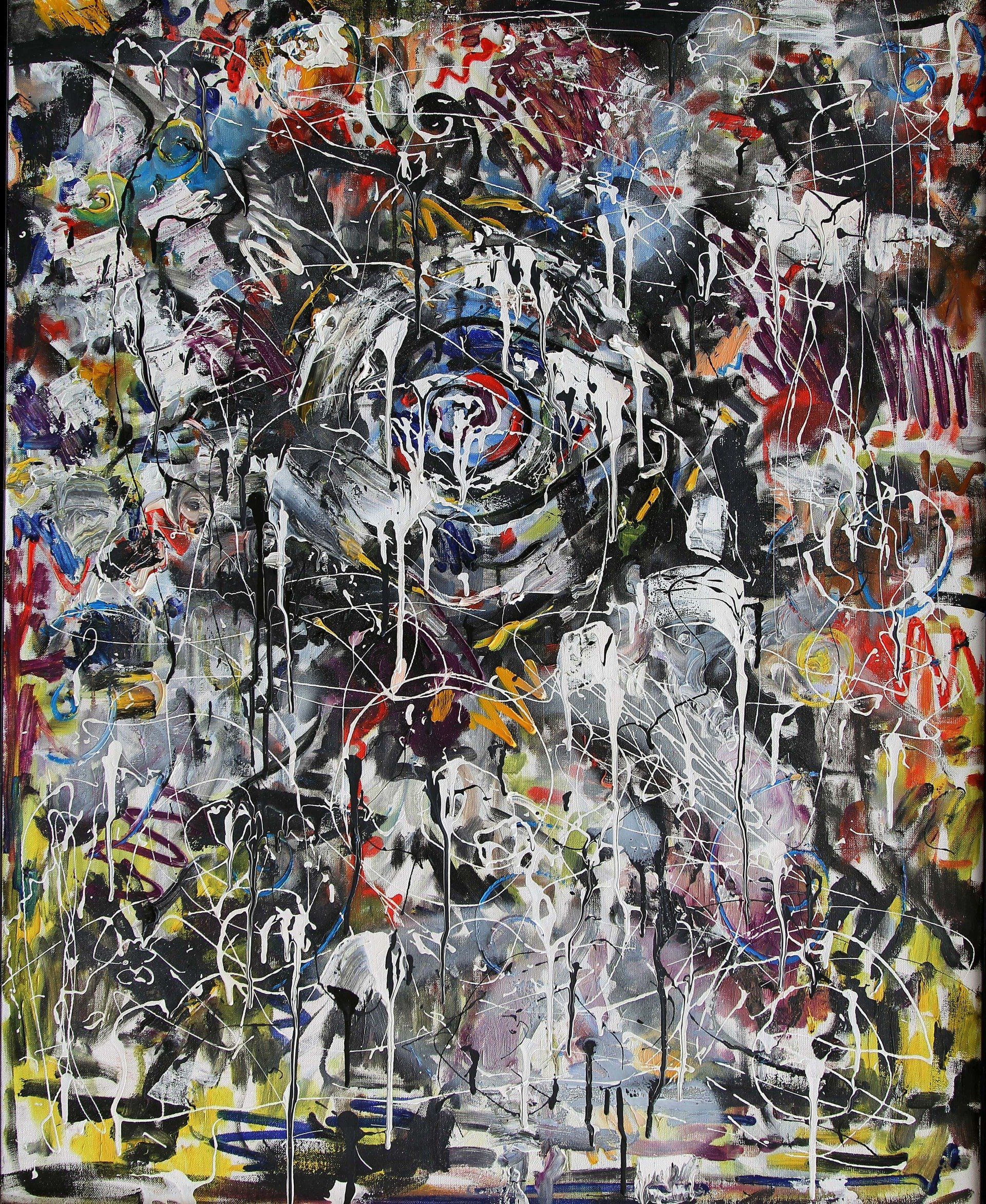
The cover of this issue is by Helena Orwell, titled Late night bathroom self-portrait,
Sometimes I look in the mirror and feel like painting me, mainly because of the aesthetics or because my face expresses something that needs to be given a way out. This usually happens at the bathroom’s mirror, at night, so I would then get my brushes, paper, oil paint tubes, turpentine oil and a plate in order to start the creative process.
The final result is unpredictable, like this one, an expressionist portrait with an hypnotic gaze I get lost in and get transferred to the day I straightened my hair and had to get used to my new reflection.
My technique is just to paint what I see, I follow the lines of the image in front of me, I basically use two blues, a red and an ochre, and white of course. However, from a simple setting and palette, the once finished portrait usually captivates me as if I had freed a latent image waiting to be brought to life; the more intense and truthful the feeling in my inside, the more it is translated into the painting.
Helena Orwell, Impression of Reflection - Usually painting at night, the ordinary scenario would be looking in the mirror before going to bed and going for the materials if I see a portrait to be made. But in this current self-portrait, I tried something different. When painting late at night, it is normal to feel tired and sleepy after 2 hours; so I decided to start painting in the morning. I spent the whole day with it, being more patient with the colours and accurate with the lines; nevertheless, my efforts were dedicated to the face and to the expression but not to the clothes, that I eventually decided to leave blank, imbuing the artwork with spontaneity.
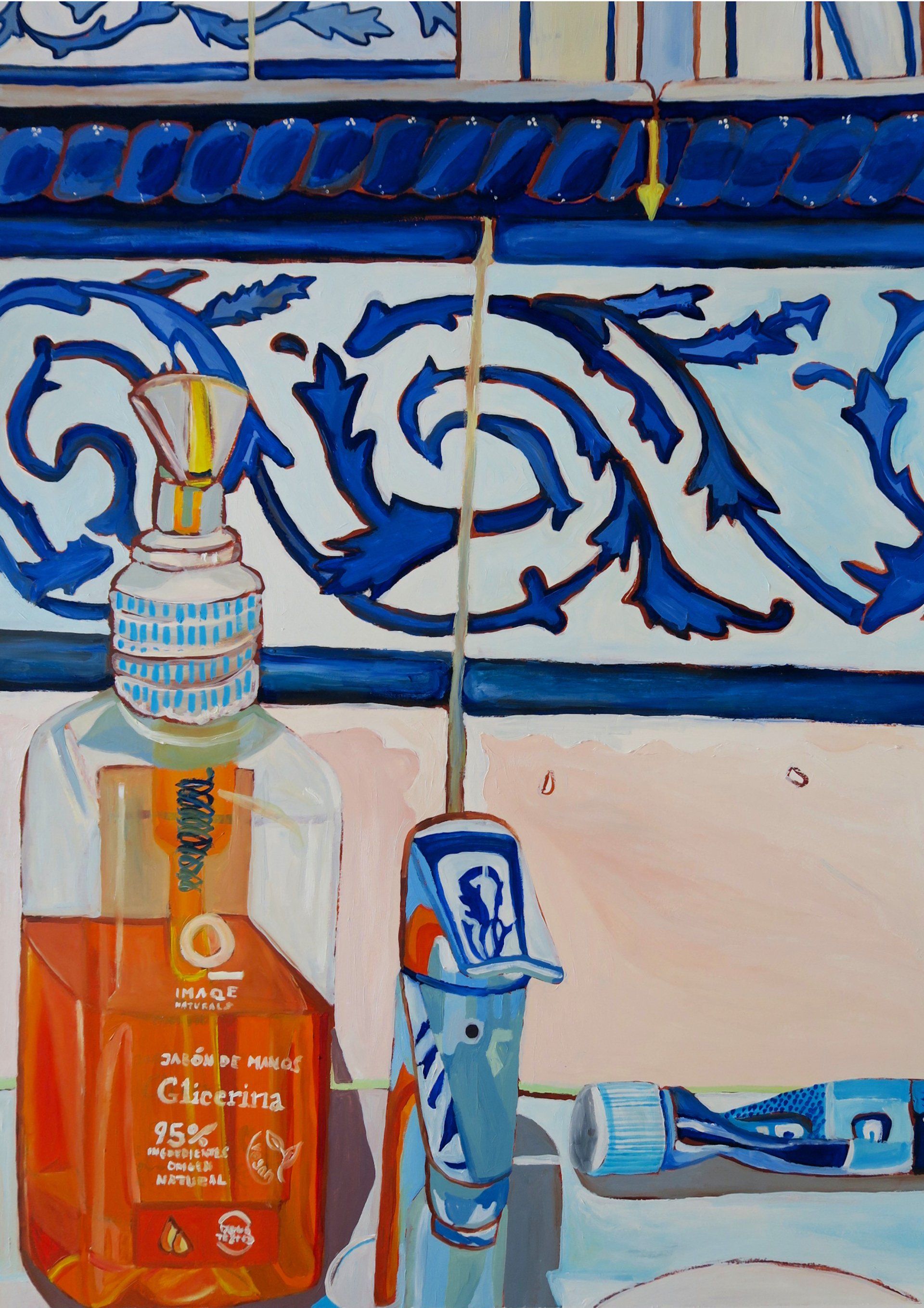
Helena Orwell, Bathroom sink - This piece is one of my favourites. It motivated me a lot because it meant a change on the usual theme, it’s like moving from the content to the container; since I paint self-portraits using the bathroom’s mirror and in this case I paint the bathroom itself. It was also a challenge regarding the size, I normally work with paper sized 29,7×42 cm; but in this case it was 42×60 cm. This is specially meaningful because I don’t use an easel, I hold the paper by hand with the help of a cardboard. Despite the technical difficulties, the result is delightful as it fulfills the need to depict my bathroom’s sink.
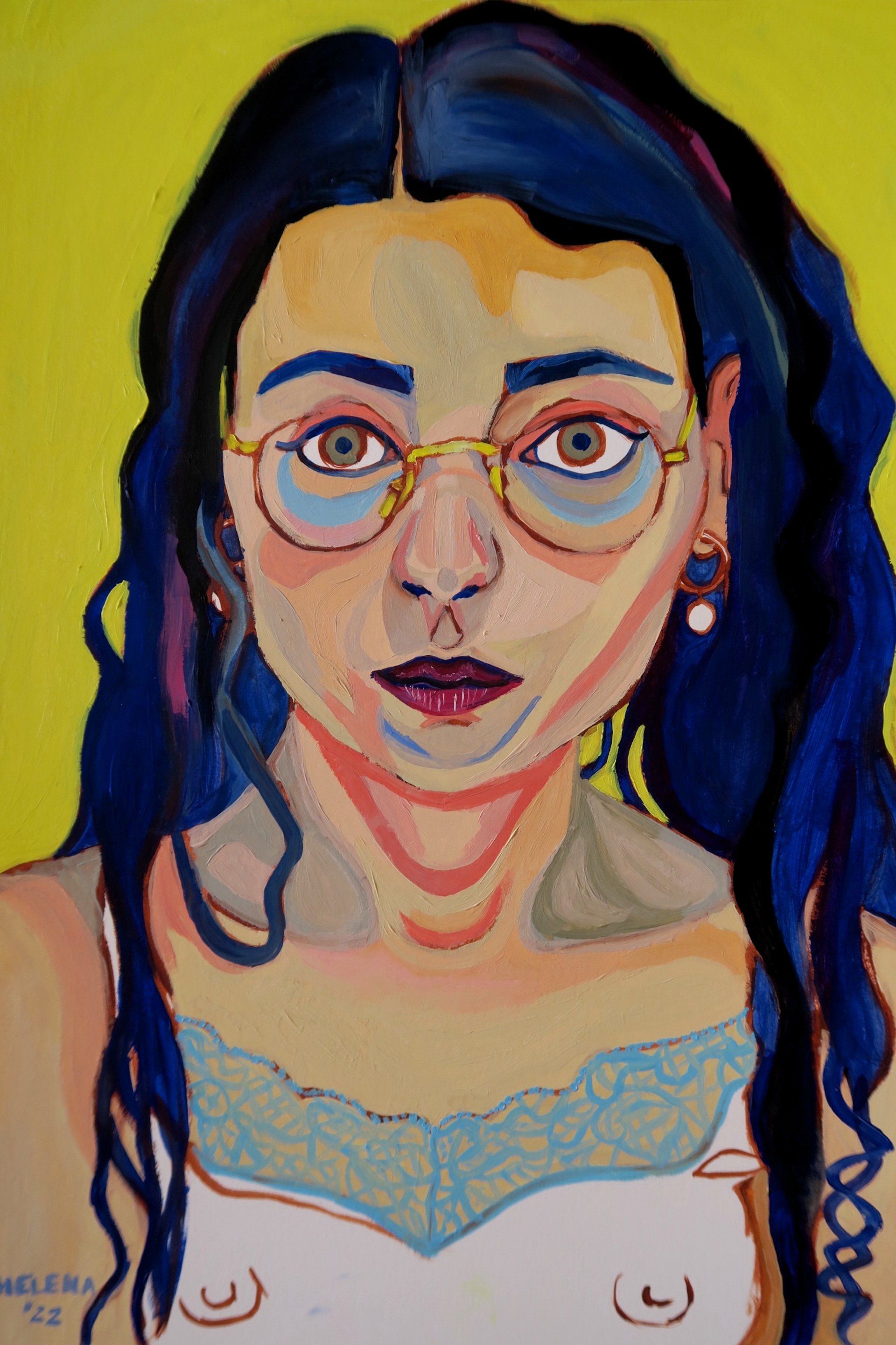
Helena Orwell, Red - I was still at my former job when I painted this self-portrait. It was made late at night, after the working day. I had a one-hour commute to that place, where I worked as a doctor. Even though the people there were nice, it didn’t fulfill me; so when I spend time on things that don’t align with my sense of realization, I focus my efforts into my artistic transcendence. It’s interesting how my emotions and processes that are happening when I paint get transferred into the artwork. I remember playing with my hair and looking for the appropriate face for the painting, but the feeling of alienation kept arising.
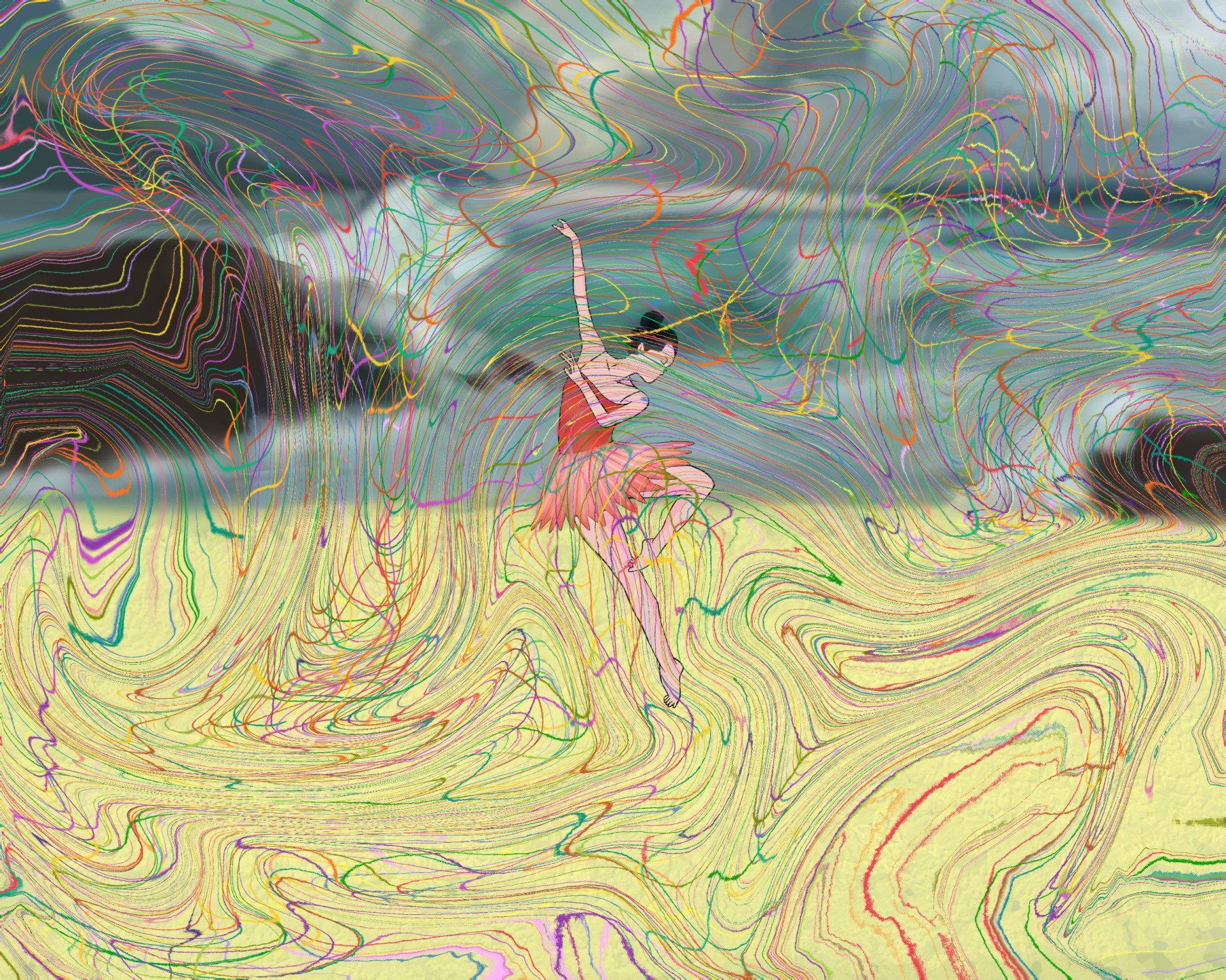
Alba Jiménez, During the storm, 2022, gouache on canvas, 28 x 22 cm (weight x height) - The background with the choppy sea expresses a moment of chaos. This is accompanied by the lines that are in the foreground expressing the feelings of restlessness and nervousness that we feel during a moment in our lives when many thoughts come together and we experience a period of crisis. Meanwhile, the dancer tries to get out of that hard situation.
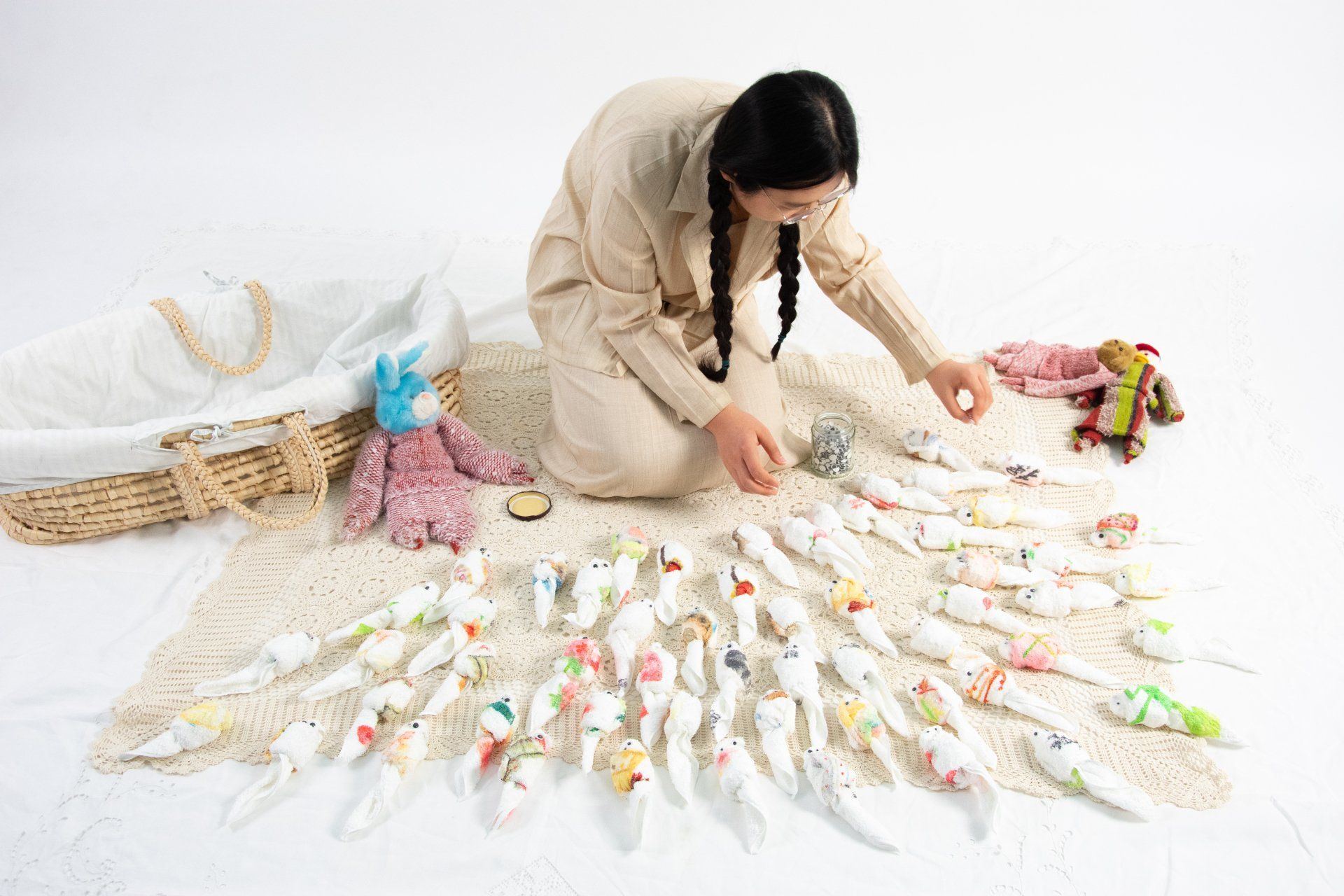
Feifan Hu, Towelling, Performance with printed textile, 2022 - Towelling transforms the simple act of folding into a performance that narrates an intimate moment between a mother and a daughter. The performer’s memory of towel animals was the seed for the project, inspired by the actions of folding a piece of towel and the secretive soft tension between mother and daughter. The printed towels capture memory fragments or objects that appeared in the performer’s childhood. The cursed words refer to the conflicts which reveal the cultural taboo. By folding the towels, the anger will be hiding away.
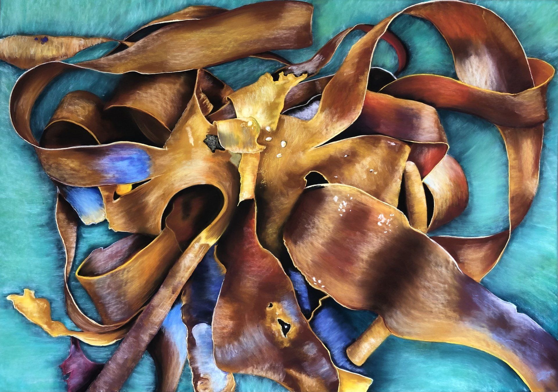
Felicity Talman, Alga Tarantella - Part of a series of pastel paintings inspired by seaweed that had washed up on the beach of the Welsh coastal town of Aberaeron. My process involves manipulating colour, shape and texture as a method of abstraction. Through this modification, I aim to create something otherworldly, sitting in an undistinguished place between realism and abstraction, that feels recognisable yet strange. My practice is predominately inspired by nature and more specifically organic forms. Using soft pastels on sanded paper allows me to utilise multiple layers of colour and mark-making, enabling me to communicate colour and shape with an expressive freedom.
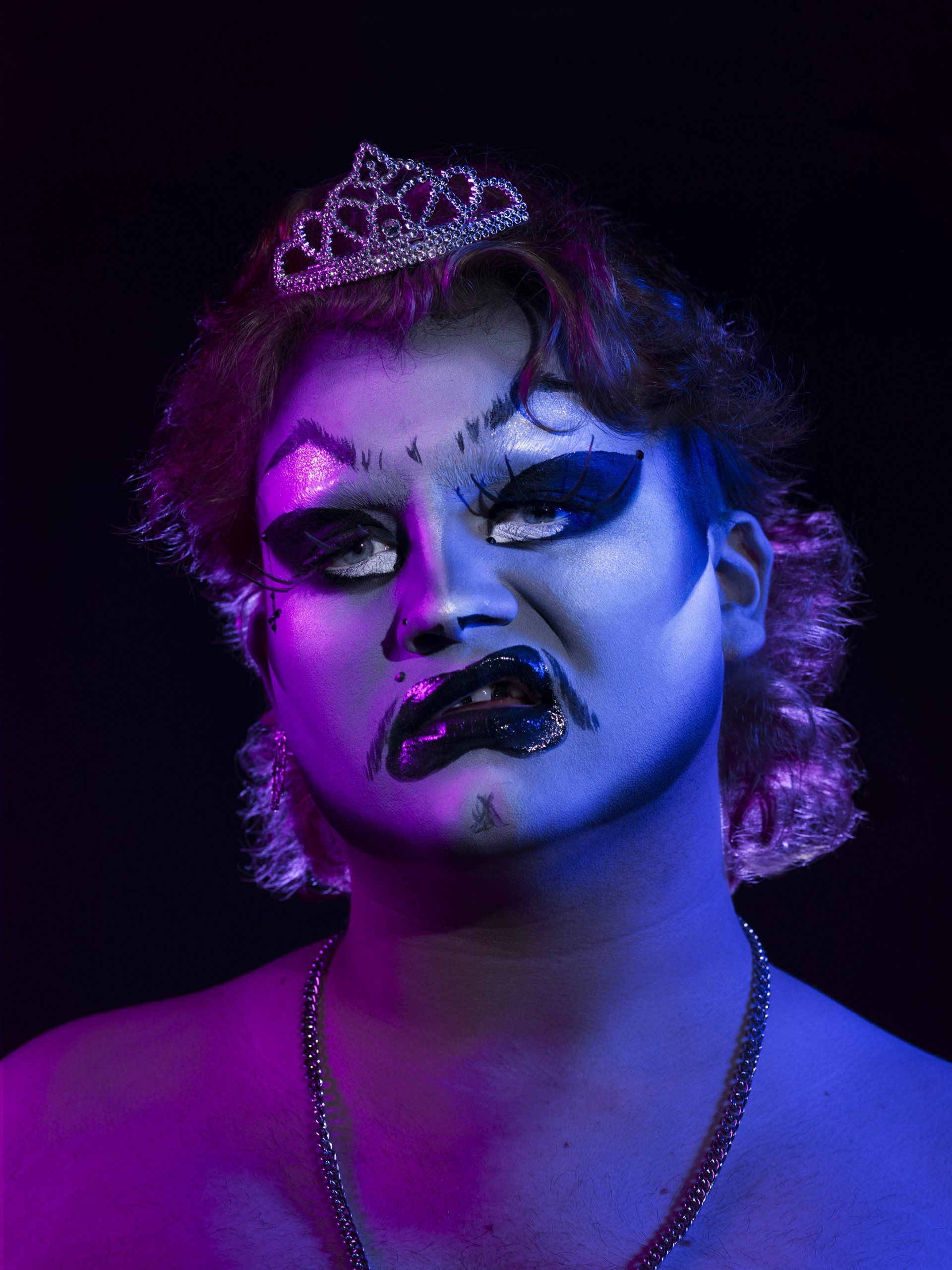
Micha Hollis, He’s a Brat - This work is a portrait of Norwich drag artist Brat as part of an on-going series where I explore and shoot the local drag community as a love-letter to the artform that allowed me to discover my own queer identity back when I first came to Norwich for university in 2019. I wanted to explore the local scene as it is full of diverse talent, everyone has something different to bring to the table and no two artists look alike and, in a society, where drag has become mainstream and therefore, commercialised into one look, I felt it necessary to show otherwise.
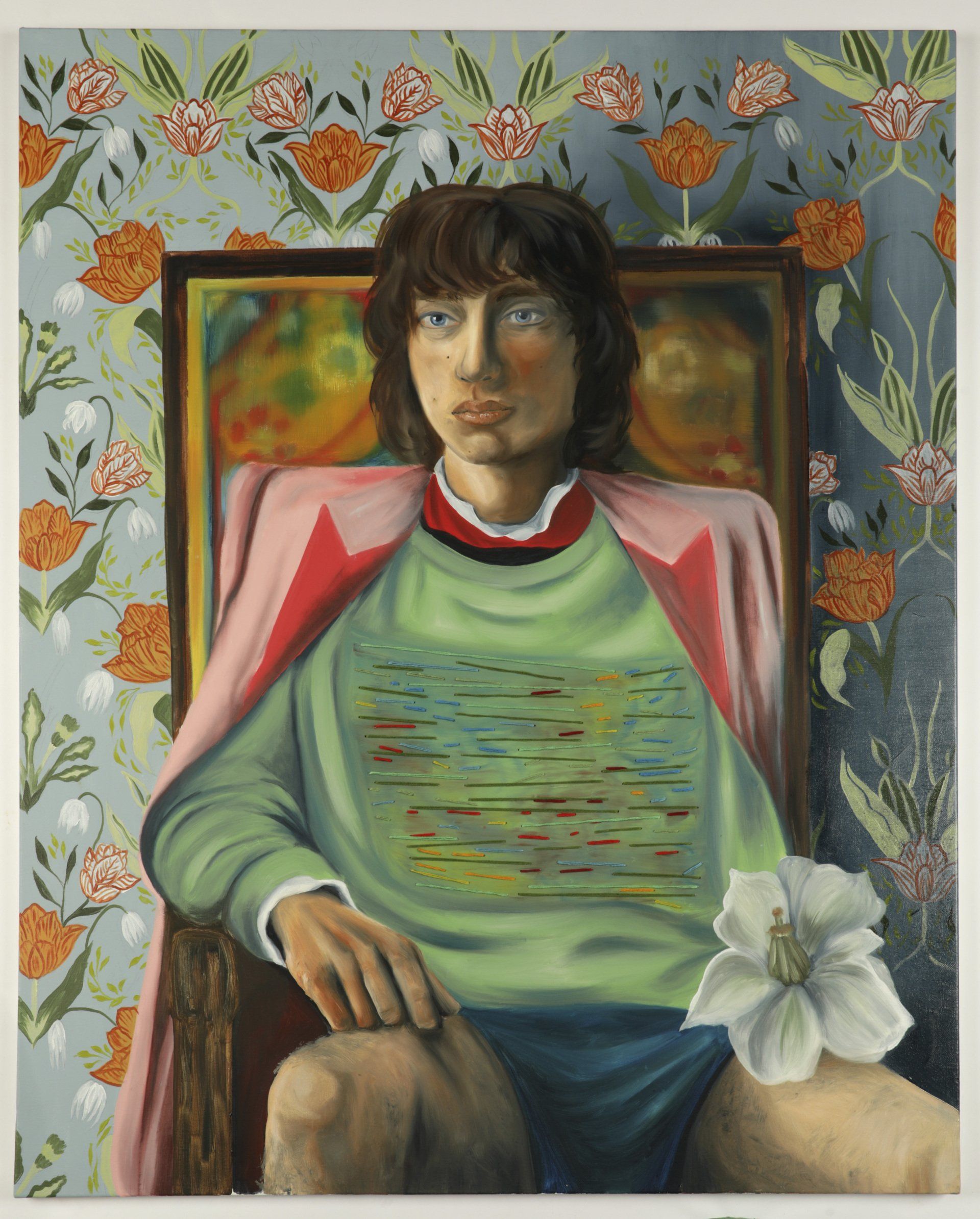
Mackenzie Gregson, Gucci Man - This work is an Oil and Mixed Media painting on Canvas. It is 100cmX81cm. I combine Oil Paint along with embroidery thread to highlight a conversation between art and craft and our perceptions on the surface of the Canvas. Art and Craft is referenced to again with a pattern inspired by William Morris that sits behind the androgynous Gucci Man. His presence echoes that of renaissance portraiture while his fashions are Modern and part of our everyday appearance.
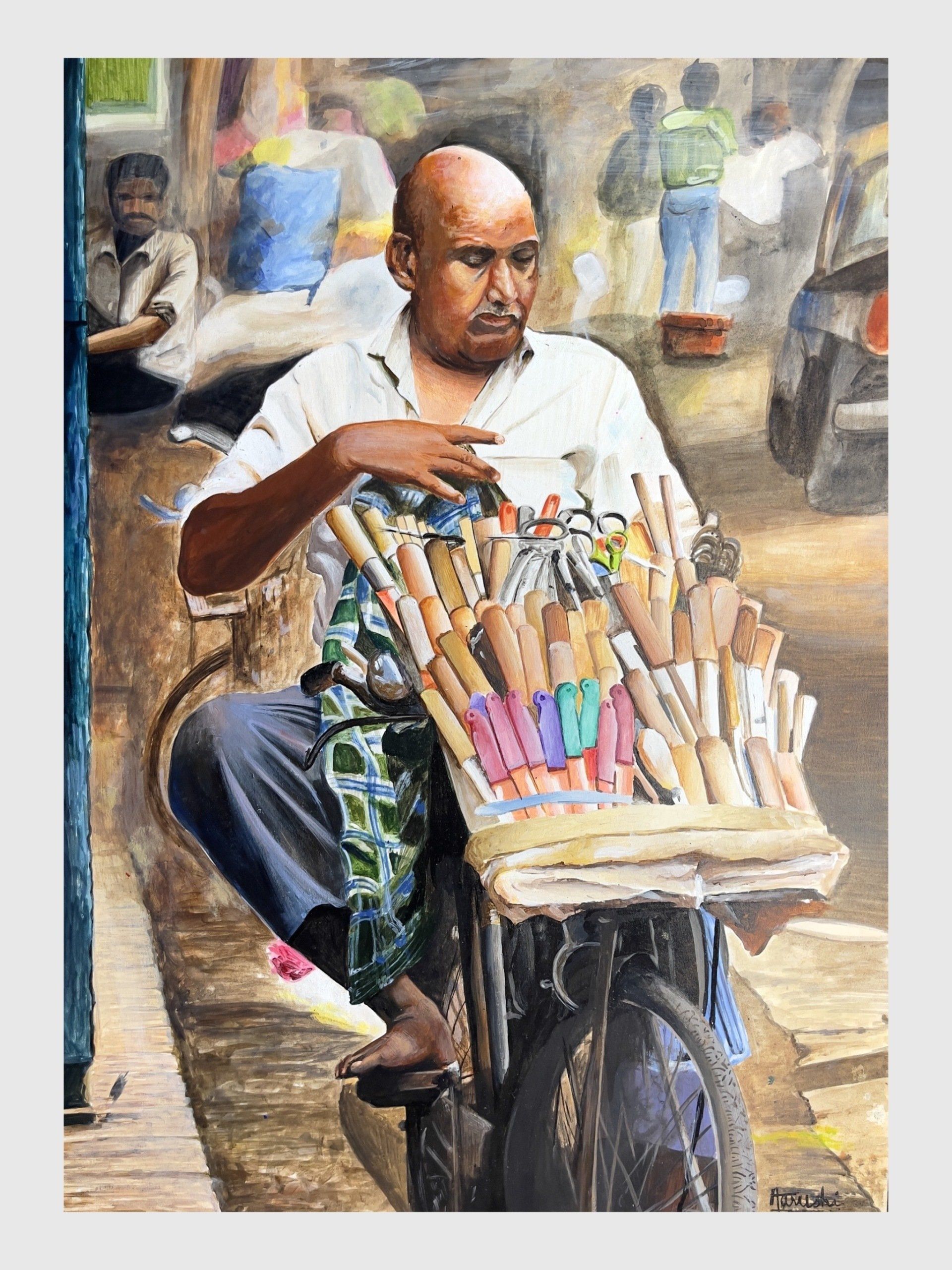
Aarushi Fatehpuria, Street Vendor - This piece is a part of an ongoing series of mine involving the idea of the human form being a constant subject of movement. I’ve always viewed myself as an action, my body never sits still and I feel everywhere at once. Overlapping limbs and harsh foreshortened angles help me dramatize this feeling and opens a gateway into understanding these experiences more. My body never feels present which is a fight I have to deal with daily, making art about this feeling is a way to stay grounded.
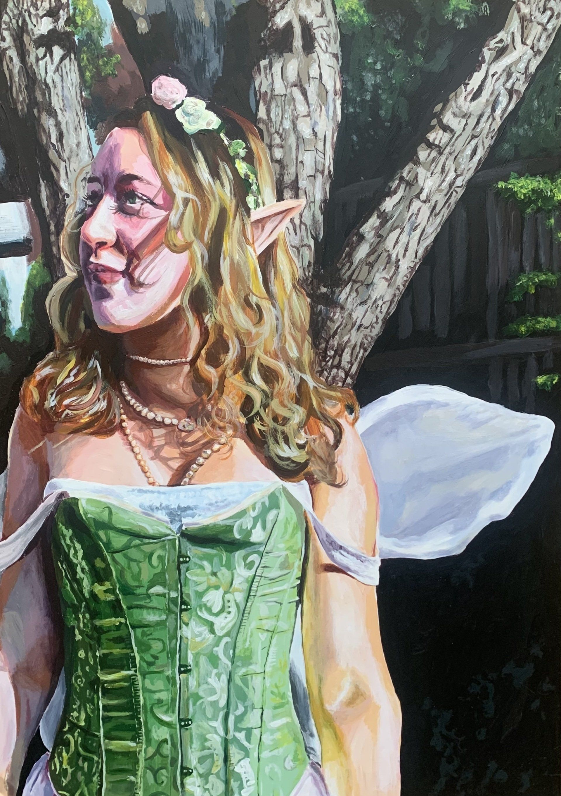
Isabella Kiremidjian, Fairy Mai - ‘Fairy Mai’ is an acrylic painting inspired by fairy tales and fantasy. This artwork is part of my A level project with the theme of ‘Imagination’. The concept behind this was to represent imagination within a portrait. I find it intriguing how humans can take reality and develop it into something surreal. I chose a fairy as the subject of my painting as it perfectly depicts how humans’ imagination have created a creature which has familiar, yet fantastical features.
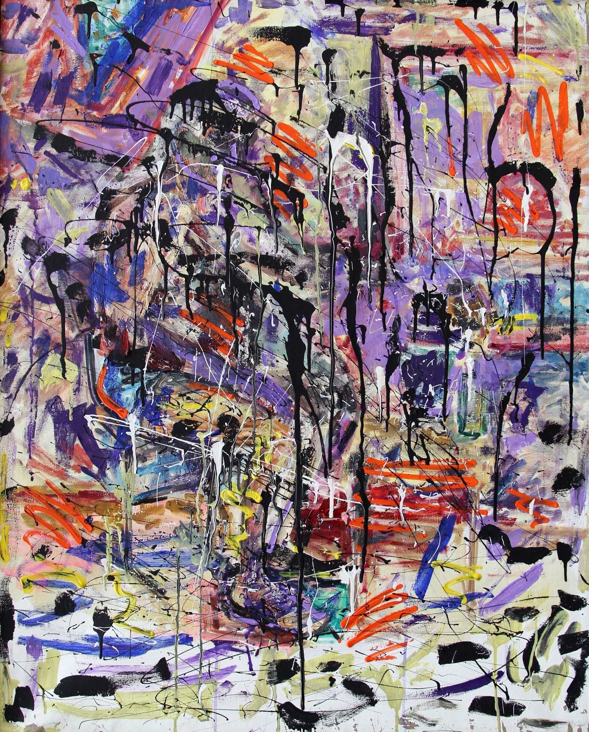
Ayan Aziz Mammadova, Autumn still life - Seven colours of the colour spectrum, usually they blend harmoniously with one another, the most famous example would be the creation green from yellow and blue, however, what would happen to them if they all quarrelled? I think there would be a terrible explosion.
The so-called explosion of colours - when multi-coloured splashes fly up, filling the space with brightness and fascinating beauty that at same time expresses the versatility, and the diversity of the world around us, opening up the possibility of freedom of choice for everyone.
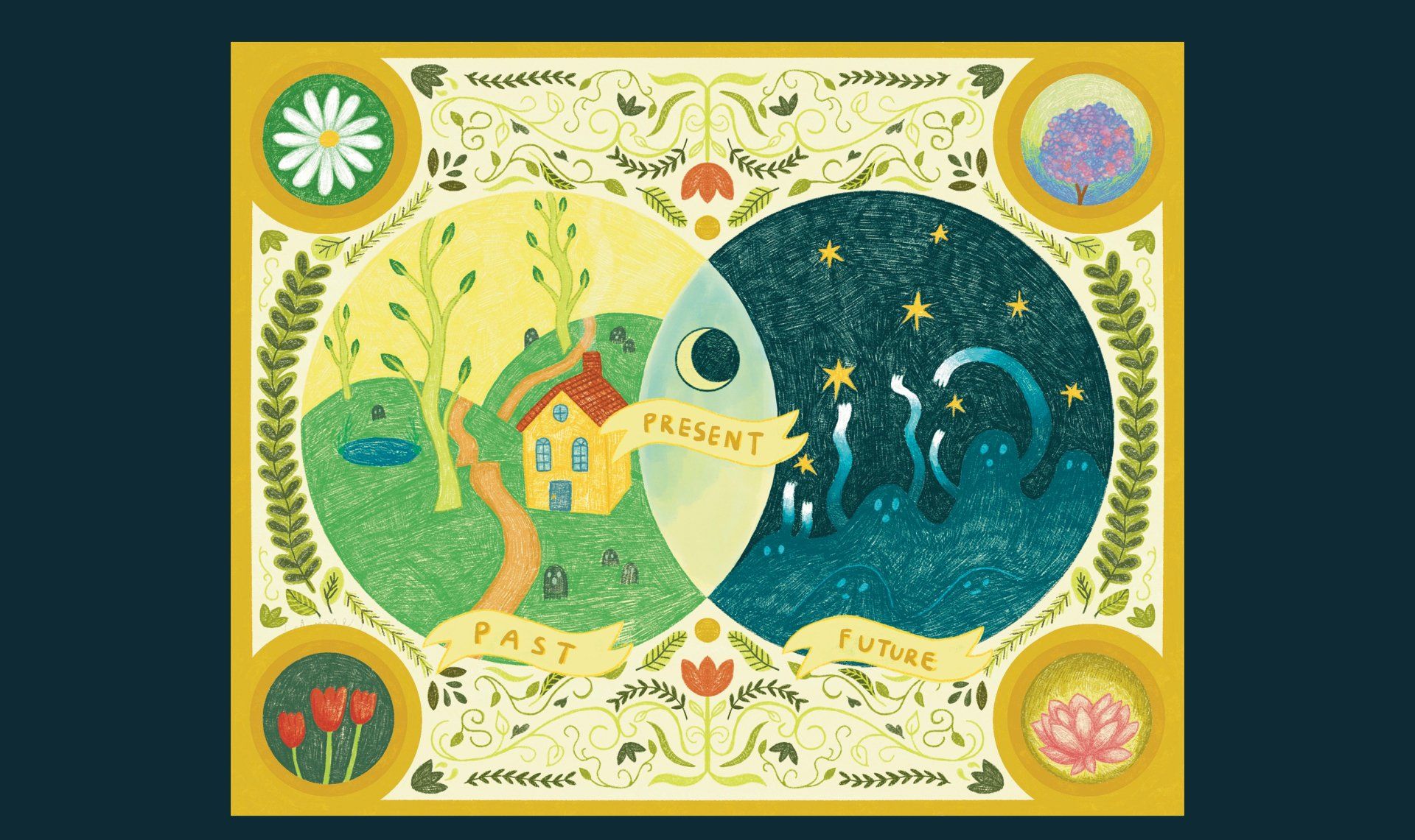
Lim Zin, Mind Map - Mind Map follows the double spheres Mercator world map, to chart the inner mind. In the center there is a Venn diagram of past, present and future. Our personality is built and housed in the past. The ghosts we have faced along our travels are made known. In the future, much is unknown. We perceive undefined ghosts, that threaten to extinguish stars of hope. The present is a fleeting intersection of past and future. The waning crescent represents surrender: only by staying present can we achieve calm and healing. The individual is balanced by interest of self (daisy) and community (hydrangea); it yearns for peaceful, unchanging calm (lotus) but also requires change and rebirth (tulips).
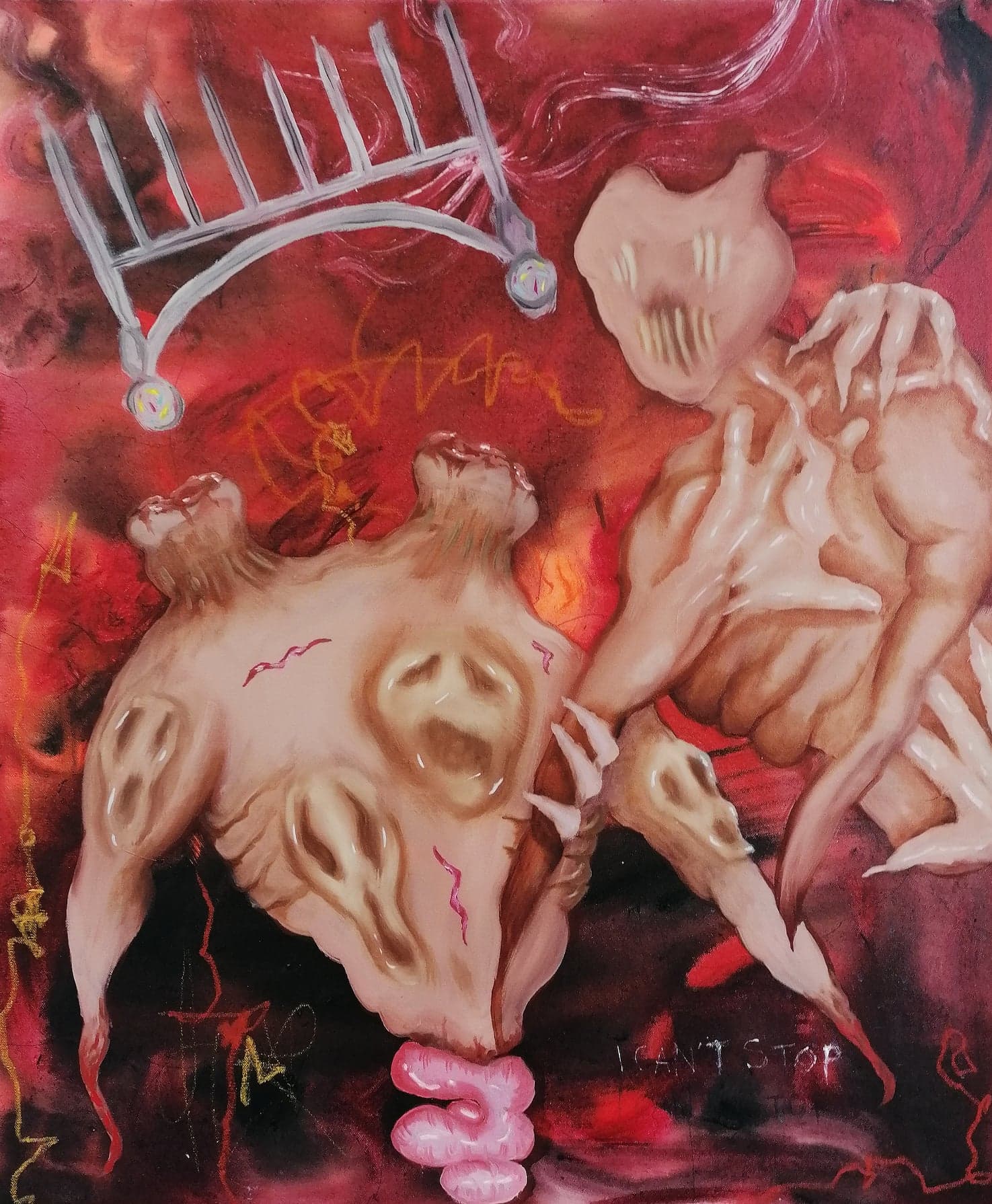
Jena Jerms (She/Her), Ira (2022) - Ira is the sixth painting in a series by fine artist Jena Jerms titled Septem Mala Somnia. In this series, Jerms explores the effects of sleep paralysis through the lens of surrealist interpretations of the seven deadly sins. Her work is concerned with human behaviour, the concept of morality, psychology and navigating personal trauma by making artwork as a means of coping. Ira represents the sin of Wrath, and Jerms’ recurring nightmares filled with primal rage and fear. She uses art as a therapeutic practice while investigating the mechanics of the human psyche.
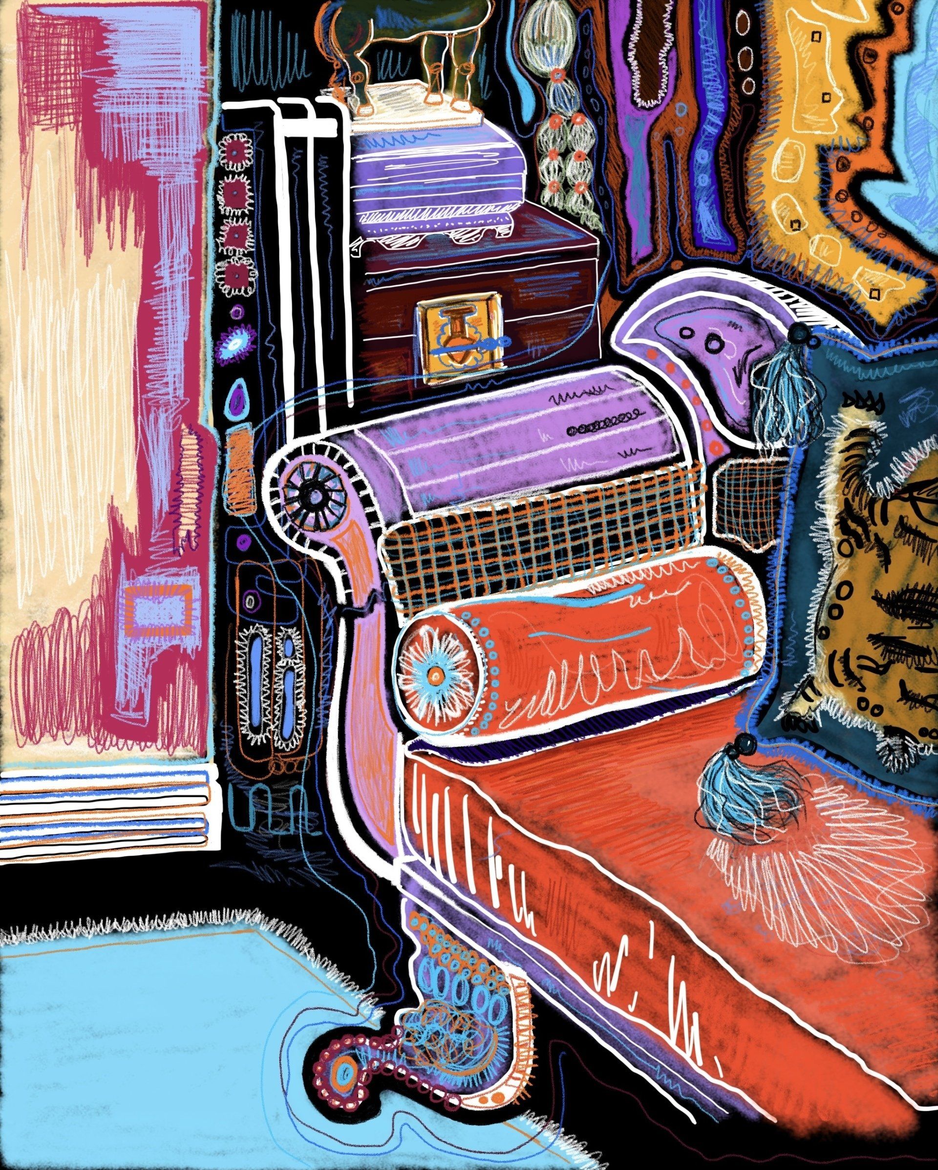
Olivia Mieke Maria-Paulina Martha, A Study of a Room I - ‘A Study of a Room I’ is one of four digital art pieces created on Apple Notes. By using a black background, a range of different colourful lines and strokes, this digital drawing explores the theme of mental health and cabin fever during the pandemic. I spent the majority of my time throughout the lockdown in this space. The living room, once a comforting, familiar, pleasant and reassuring space transformed into a cage. Having the same routine every day, month by month, in a static environment, this space inspired me to re-imagine objects, furniture and colours. By playing with my imagination and re-assessing my surroundings, my current art style was developed from this experience.
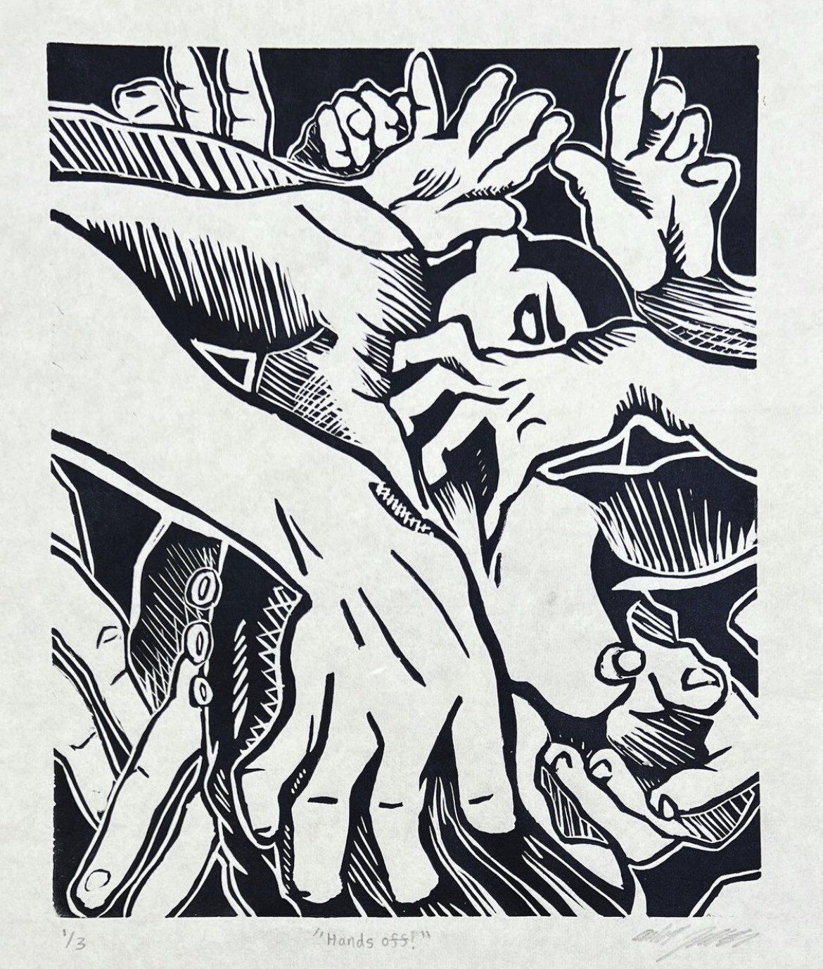
Aleah Zerance, Hands Off! - This piece is a part of an ongoing series of mine involving the idea of the human form being a constant subject of movement. I’ve always viewed myself as an action, my body never sits still and I feel everywhere at once. Overlapping limbs and harsh foreshortened angles help me dramatize this feeling and opens a gateway into understanding these experiences more. My body never feels present which is a fight I have to deal with daily, making art about this feeling is a way to stay grounded.
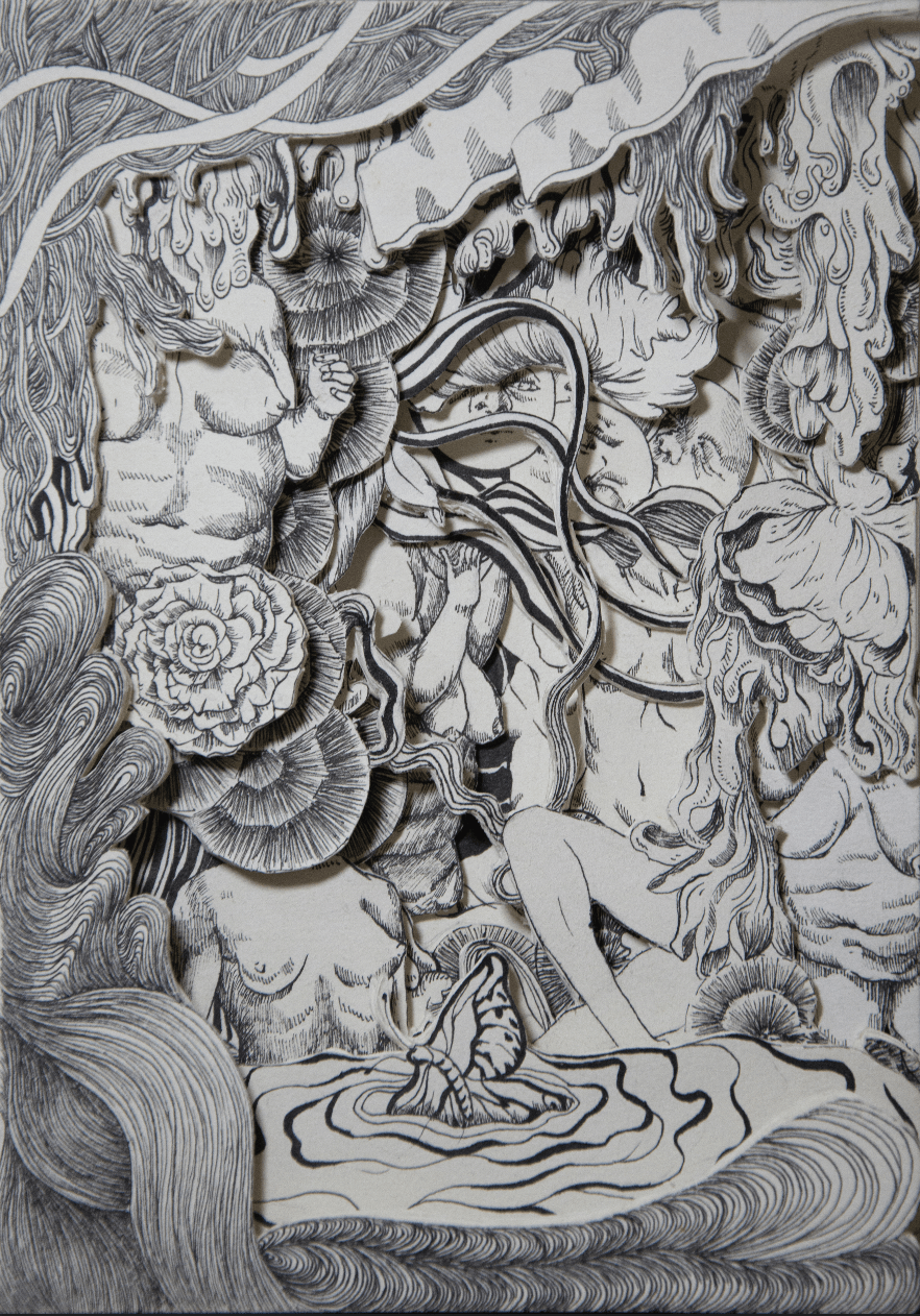
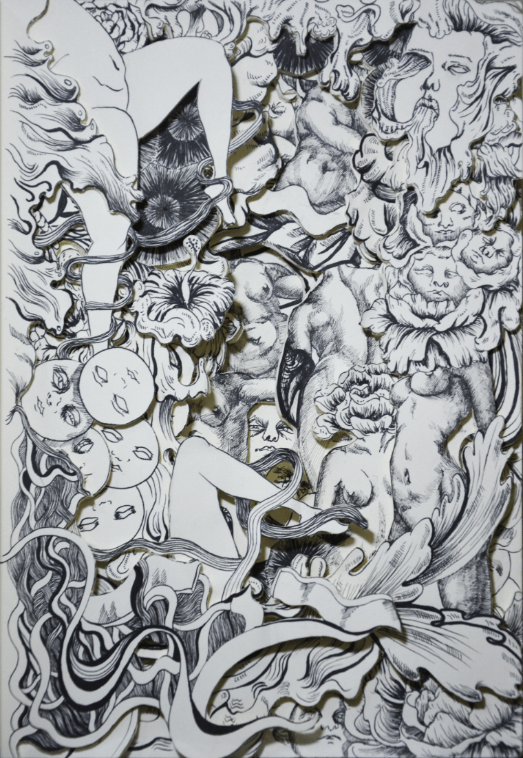
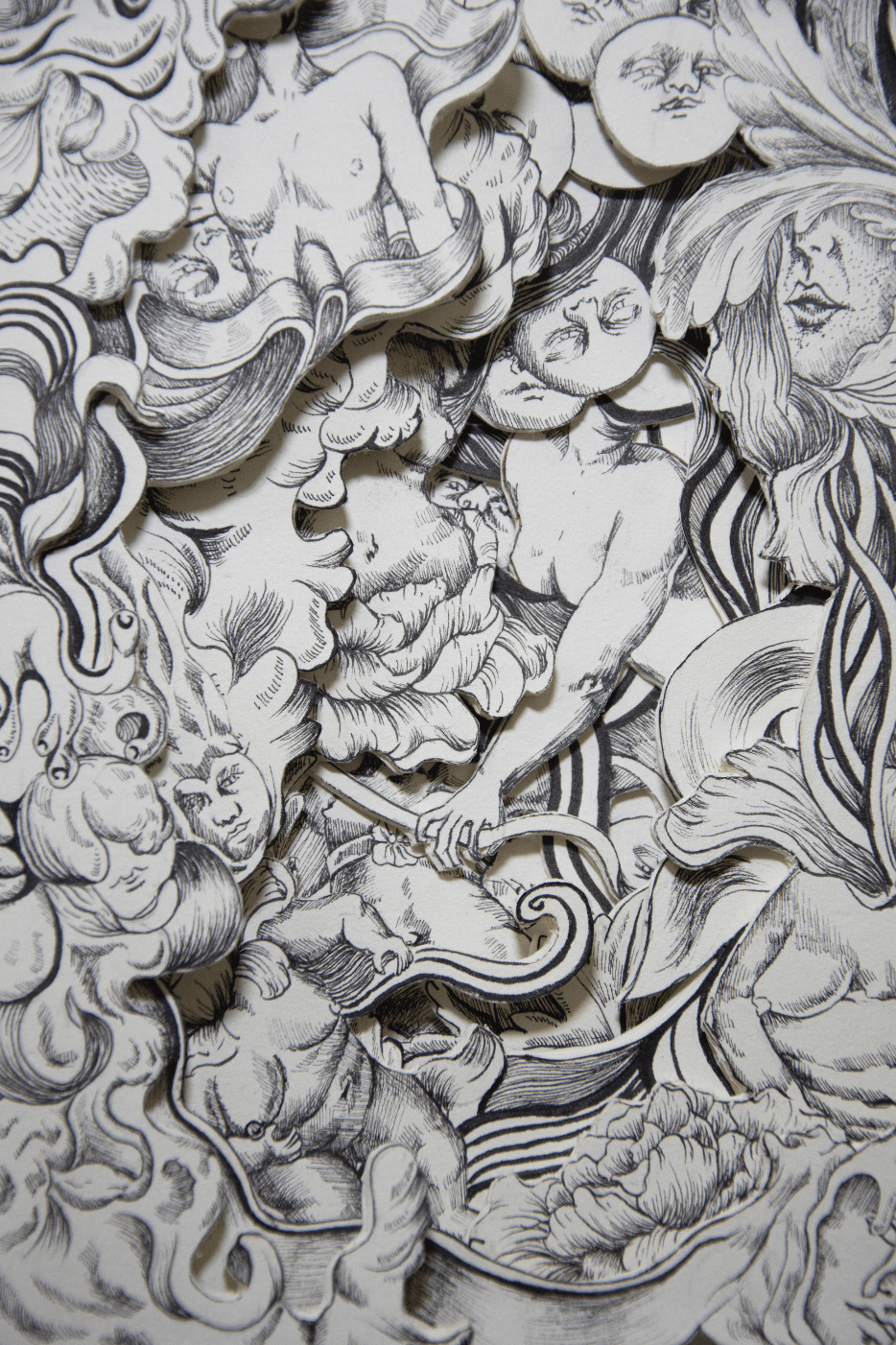
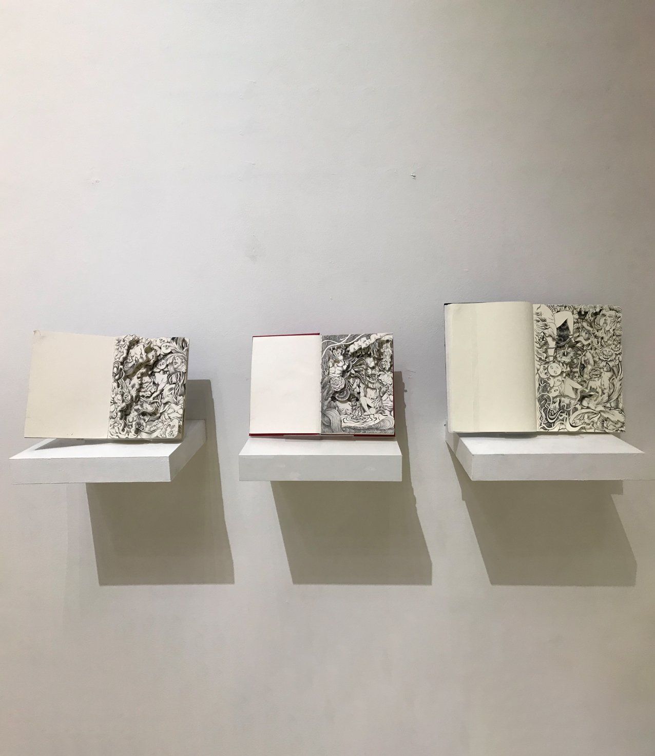
YANG HAN WEN, Gaze (a series) - These three books are a series, Through my intricate and detailed sketchings and paper cuttings, I convey my own understanding of beauty, as well as what it should be. Particularly, how we should practise self-love and acceptance.
Due to the pandemic and quarantine period, people spend most of their time at home and spend more time online. It brings more attention to the virtual world. It is also gradually affecting our subjective impressions of beauty.
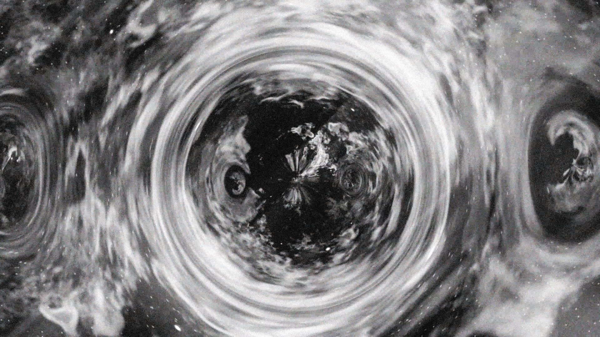
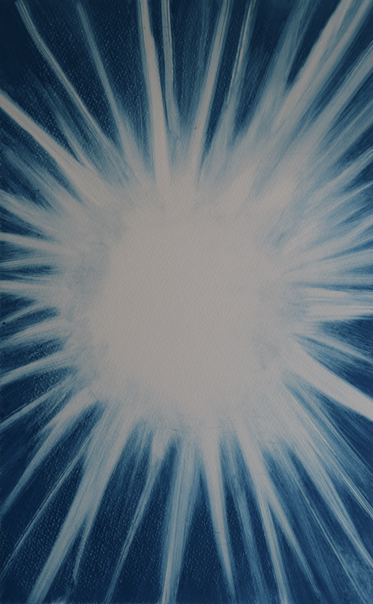
Diana Rojas, Event Horizon - “Event Horizon”, which shares its name with an astronomical term that means a theoretical point of no return associated with black holes, is a single channel audiovisual piece that explores light bending as a signifier of the colossal and divine in space and art. These real and illustrative instances of light bending remind us of the distance between us and the invisible and immense. “Event Horizon” focuses on the moving light that signals the unknowable
Discover More - www.dianarojasart.com / Instagram: @dianarojasart
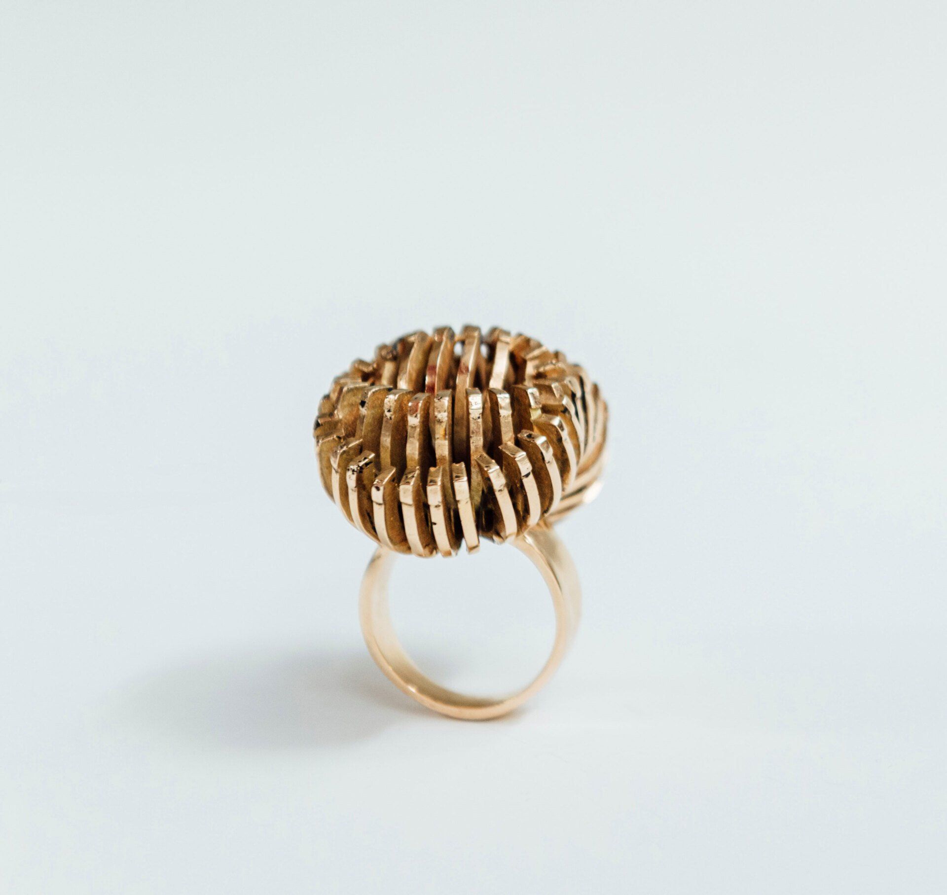
Glover Marfo, Camouflage - As a young Ghanaian artist exposed to the harsh realities of society by living in squatter housing in my formative years, I became fascinated at creating adornments which evokes protective sentiments, remain elegant, and convey a sense of power to both wearer and viewer. My work appropriates motifs and design attributes of vulnerable living organisms, their defensive mechanisms and, other attributes essential to their survival within their environment. Ultimately, my current body of work is a meditation on our shared struggle for survival, evolution, and pursuit of a better world. Photo credit : An Wang
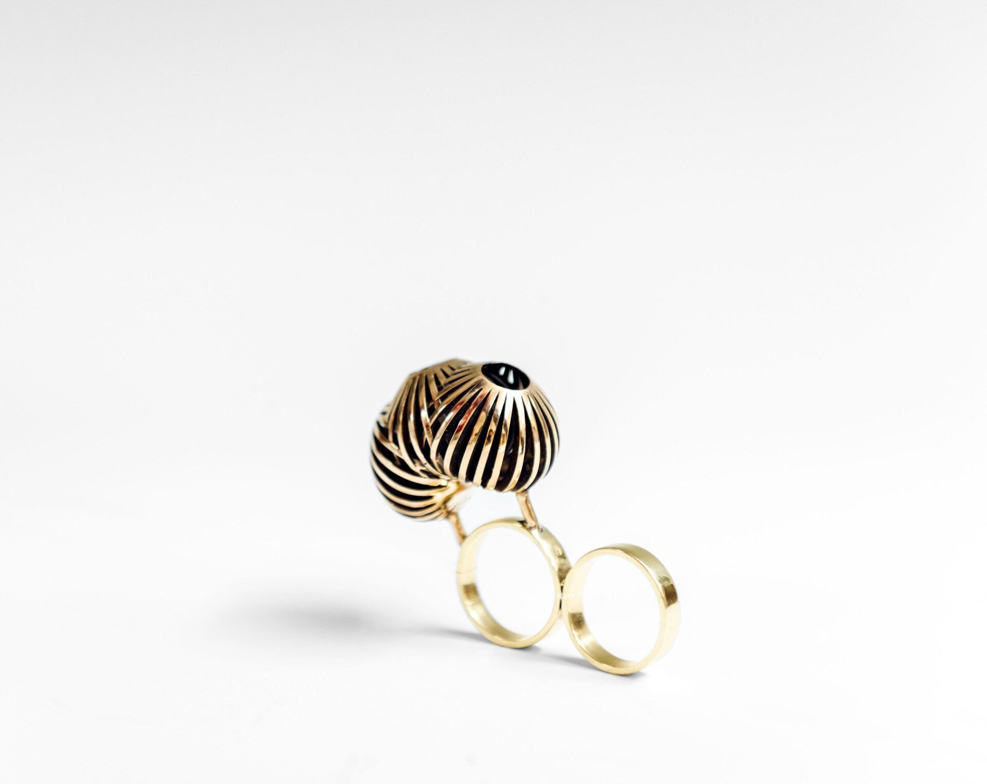
Glover Marfo, Fearless - My work adopts how symbolism and functionality can be intersected to create jewelry adornments, which can evoke protection, elegance and metaphorically convey a sense of power to women who have suffered from physical and emotional abuse.
As a way of navigating my current socio-cultural space as a student in the US, I draw from my past and create sculptural jewelry borrowing from both African traditional and contemporary aesthetic languages while entertaining cross-cultural influences of my lived experience. As an artist I wish to create jewelry which embody force and grace when worn. Photo credit : An Wang
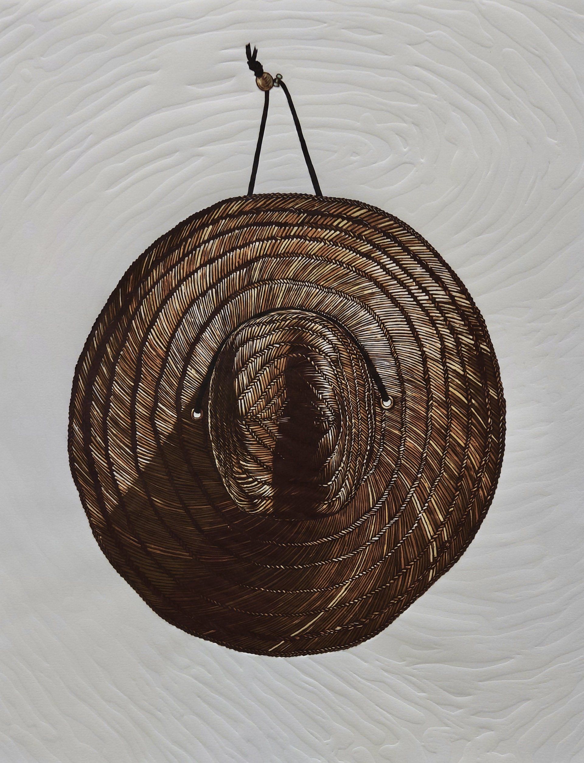
Zoë Couvillion, For Tomorrow - The centered imagery of a hat in For Tomorrow is a reductive woodblock print, made with 14 separate layers of ink applied by the same hand-carved surface. The surrounding embossed paper initially reads as abstracted lines, but is actually an enlargement of the artist’s fingerprint. The final composition is a reflection on those tangible things that we use, leave-behind, and then return to: reminders of the intangible connections we share. It measures 31 inches (78.74 cm) by 23.75 inches (60.325 cm) and was completed in March of 2022.
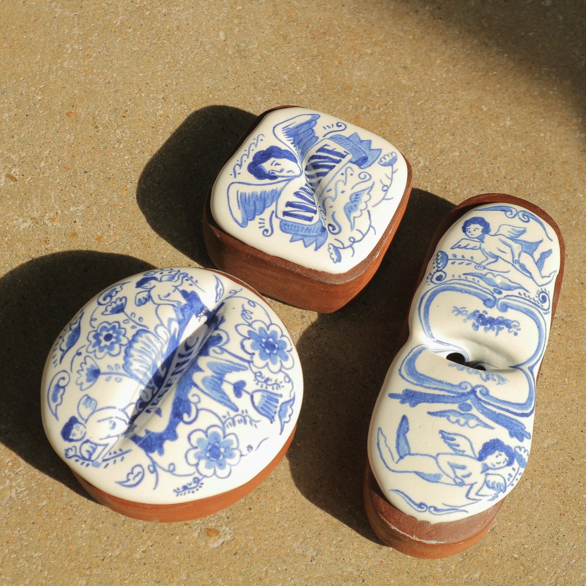
Jihyun Kim, Delicious pill - The European pharmaceutical profession originated in the 18th century. The pharmacists used colourful Delftware to store their medicines to attract customers. European potters who make such pots applied tin glaze on earthenware jars and painted to imitate the luxury of white porcelain.
I interpret the tin glaze as a way that was used to conceal flaws to look appealing. Some people nowadays are taking drugs in defiance of the dangerous truth or on the other hand, drug companies allure people with appealing, flamboyant packages. People are intentionally or unintentionally consuming drugs like a sweet little candy.
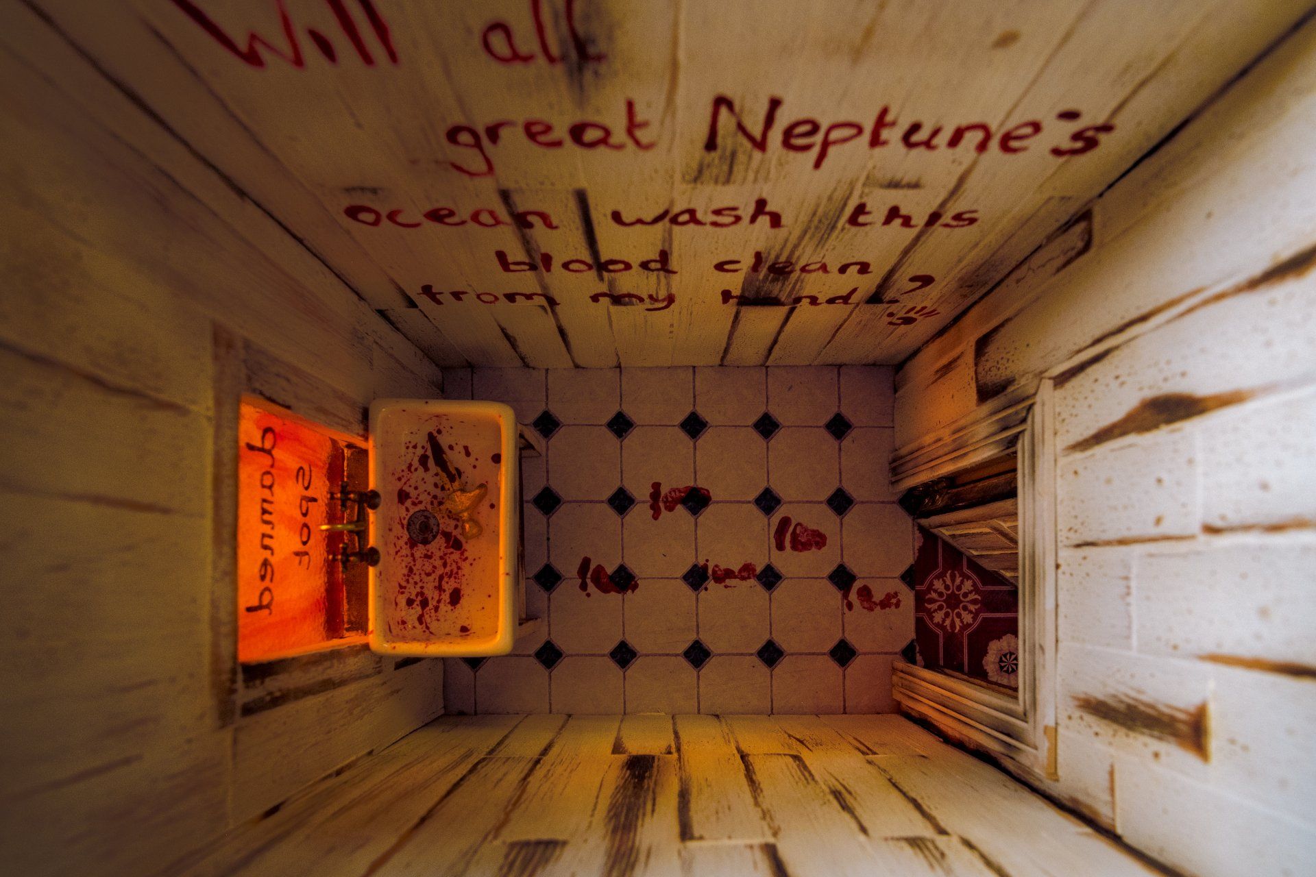
Louise Cunningham, Macbeth house - The Macbeth house allows the viewer to become immersed in Shakespeare’s play as they move from room to room using hidden keys and following bloody footprints. Each room contains one piece of removable jewellery that can be taken out and worn. The arthouses I produce combine my skills as a silversmith with my abilities as an artist. Using traditional techniques, I produce one of a kind art pieces that celebrate my passion for Gothic literature and jewellery.
Ayan Aziz Mammadova, Universe - Summer morning, pleasing to the eye with bright colours… In an instant, everything can be destroyed by pressing only one button...and then the dark skeletons of once towering cities will appear before the eyes...and there, somewhere far, far away, it froze, but some kind of life still glimmers…sadly, drooping, lowering their heads, they try to survive, once amazing with their unimaginable beauty and quivering tenderness, beautiful flowers...now the cold breath of suddenly coming winter...has made them orphans, her cold breath enveloped the gardens with magic flowers that were full of life and children’s laughter until recently, now frozen in a sad expectation of their end, covered with hoarfrost... crying with tears.
Ayan Aziz Mammadova, Evil Eye - This depiction of the evil eye part of the series of art pieces that I have devoted to this topic. The evil eye is a curse or legend believed to be cast by a malevolent glare, usually given to a person when they are unaware. Many cultures believe that receiving the evil eye will cause misfortune or injury. Talismans created to protect against the evil eye are also frequently called “evil eyes”.

Ayan Aziz Mammadova, Mood Flares - The world we live in is a colourful canvas in which all the colours of life are involved... It is orange, turning into red - the colour of despair, the cry of children to the sounds of sirens somewhere very close to war, blood and fighting… this is black - destructive, unreal, impossible, but alas, it became possible, real… purple is the colour of creativity… blue is a reflection, and thus the realisation of righteousness, that is, the ascent to the blue colour, however, only yellow is the lowest step of the ascent, stepping on, perhaps, an opportunity for humanity to climb it, and move up to blue - the colour of heaven, spirituality and forgiveness...

Maraki Girma Mamo, Killing The Ego - I think to grow as a person we must kill our ego and detach from things that drag us down. Those things maybe part of us ,but with little strength we have we must kill the monster within, before it kills us.
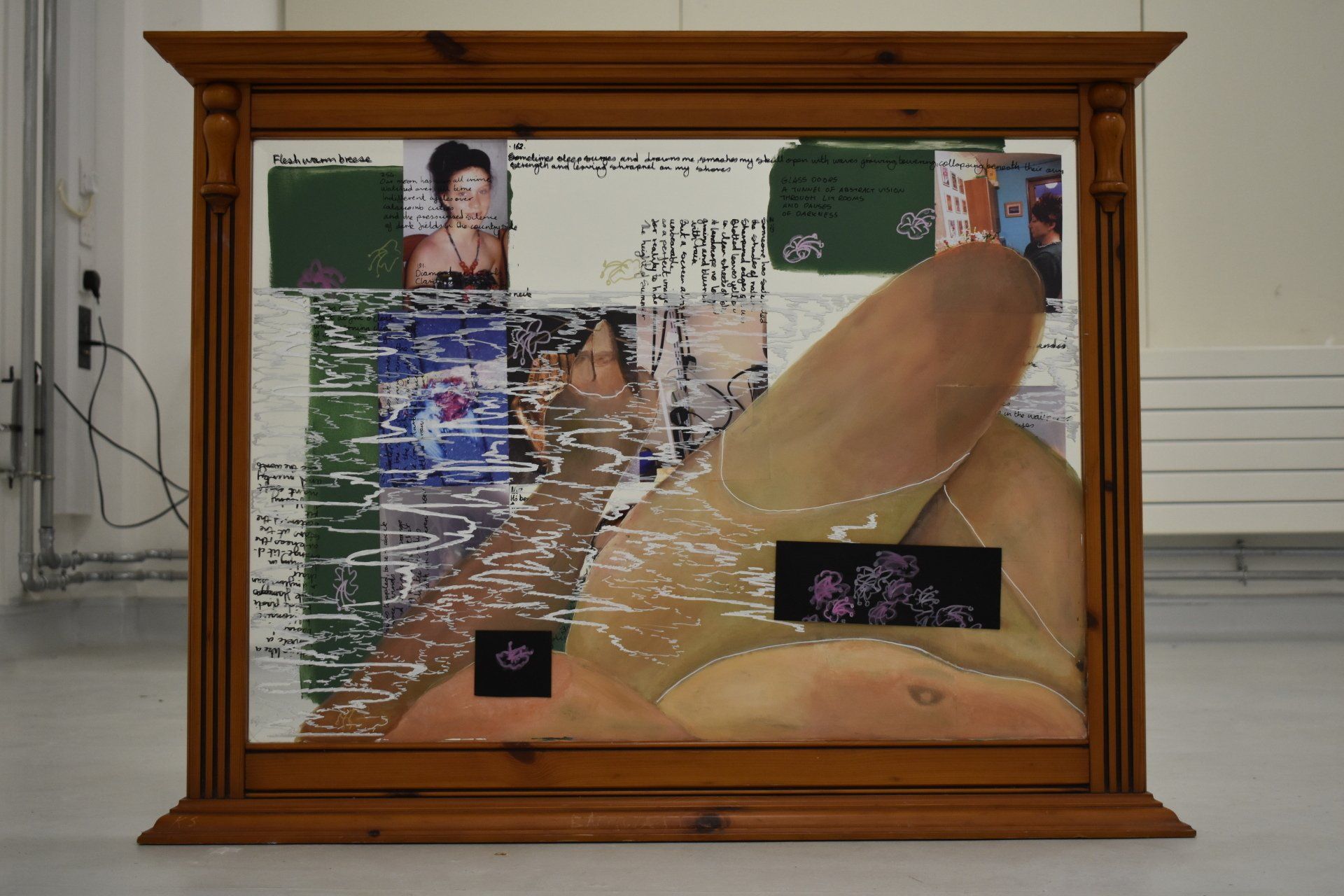
Katie Stewart, The Blind - Narrative cannot exist in a vacuum, yet this is a common issue in a society regimented by binary and mono perspectives. Katie Stewart collages layers of found objects and photographs taken in different variations and repetitions to reflect the inherent abundance of contexts and natural multiplicity of narrative. Of such a plethora, one image or scene is chosen and recreated with paint, overlaying the mixed media piece, and demonstrating how one idea may be elevated at the expense of others. Automatic writing is incorporated into the work in reference to the fragmentary nature of understanding and association in the human psyche. The concept of our experience of existence itself as collage founds Katie’s practice.
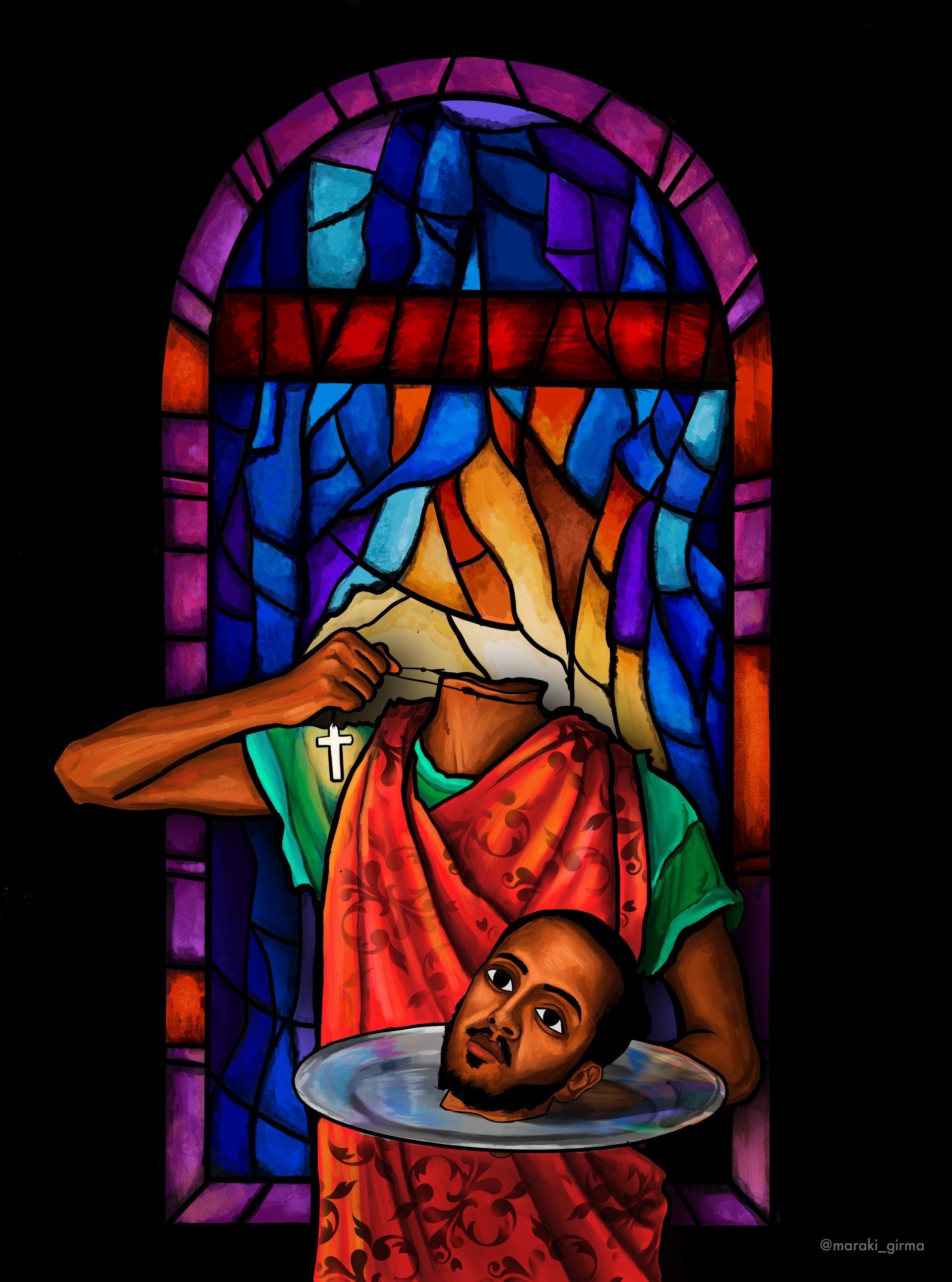
Maraki Girma Mamo, Martyr - There is an Ethiopian saying which goes like this. “Rather than my seal to be broken , may my neck be decapitated” which means rather to take off the cross on my neck it’s better for me to die. This is a motto I try to live by, so this piece is dedicated to this statement.
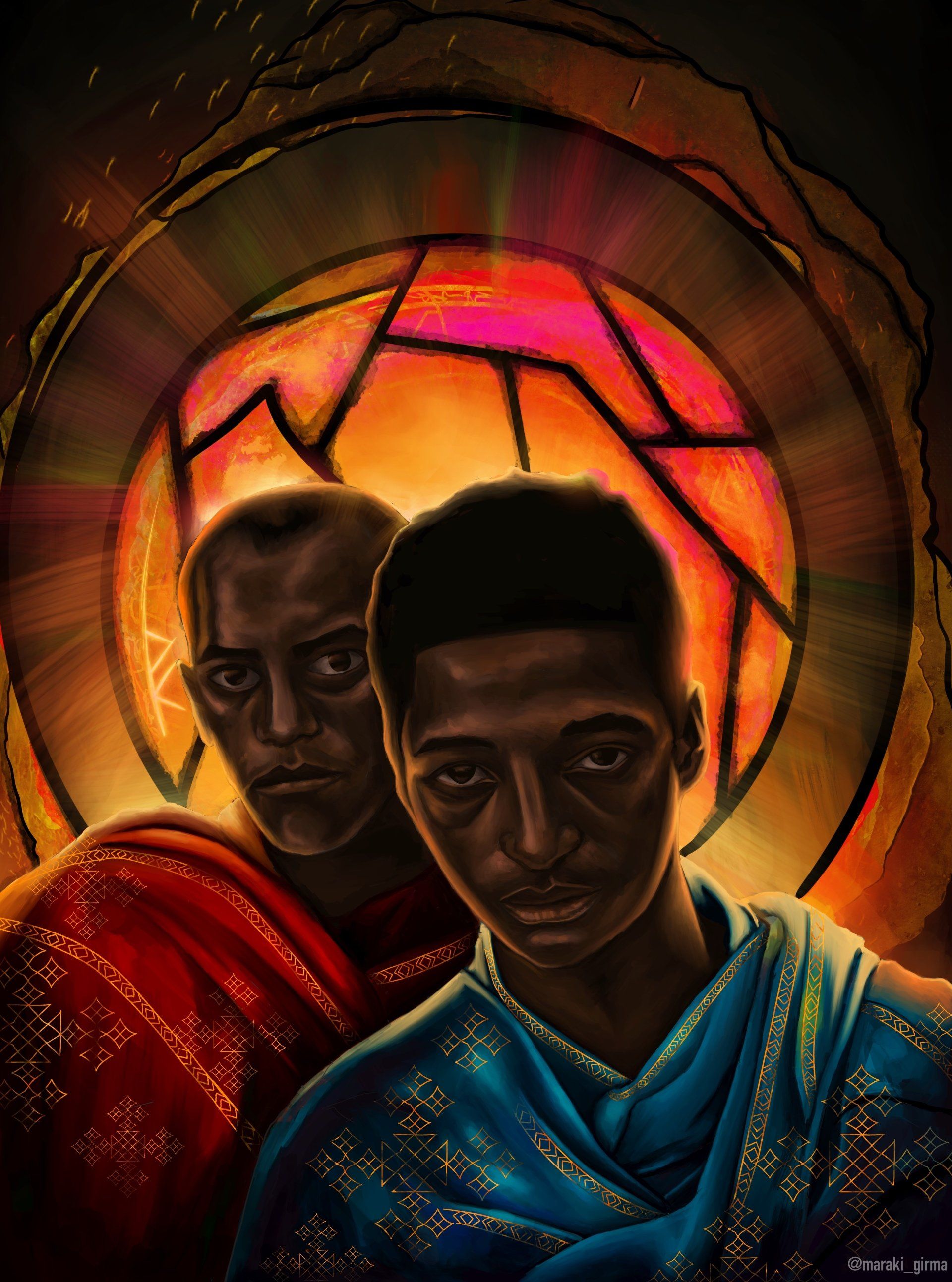
Maraki Girma Mamo, Black Origin
Sonia Dawkins-Auguste, Society - My first drawing that I connect to, I haven’t felt emotionally connected to any other piece of art in my life. I usually just produce anything. Produce, it wasn’t me being an artist I was just producing art. There is color in this drawing and at the same time it seems to lack color. I didn’t know what to name this piece at first but I came to realize it resembled various aspects of our society. We all can show colors, but can we express these colors. I can show the emotion of happiness, does that mean it is a true feeling. The eyes seem very alive, they stand out more than any other part.
Manon Cervantes, The Black Hole - I am Manon, I decided to present this painting which is “the black hole”, representing my epileptic seizures, which I have been making since the age of 9 years. I am like frozen, impossible to stop it. I just undergo the crisis. And I will have no memory of this crisis : It is just nothingness for a few minutes : the black hole. But my color palette remains very vivid, always the same in my artwork, like a signature. My artwork revolves around sign language, having grown up in a deaf family, being hard of hearing.And also being bipolar (in particular : depression). I try to highlight them because they are still unknown to the world. Maybe because mental health is still a taboo in our society ?
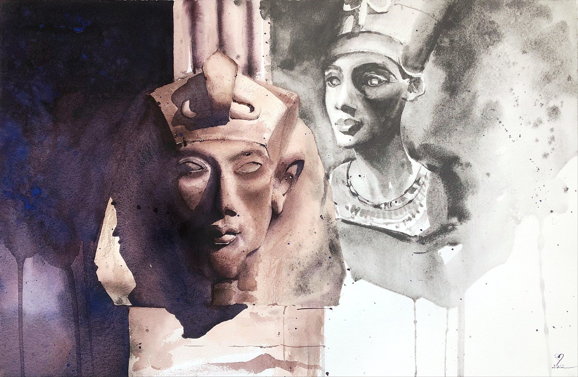
Elizaveta Smirnova, Afterlife - This artwork was inspired by an exhibition - ‘Treasures of Tutankhamun’s Tomb’. It explores the idea of the afterlife - what’s left after people are gone. Although depending on the religion or personal beliefs, people view the afterlife in different ways, it is obvious that there are certain things that keep memories of certain people alive even thousands of years after their death. The idea that we still remember those who lived more than 3000 years ago is truly fascinating. The afterlife theme is also explored through the mix of media - watercolour and watercolour graphite, as in people’s minds ‘death’ or ‘afterlife’ are often associated with black and white depiction.
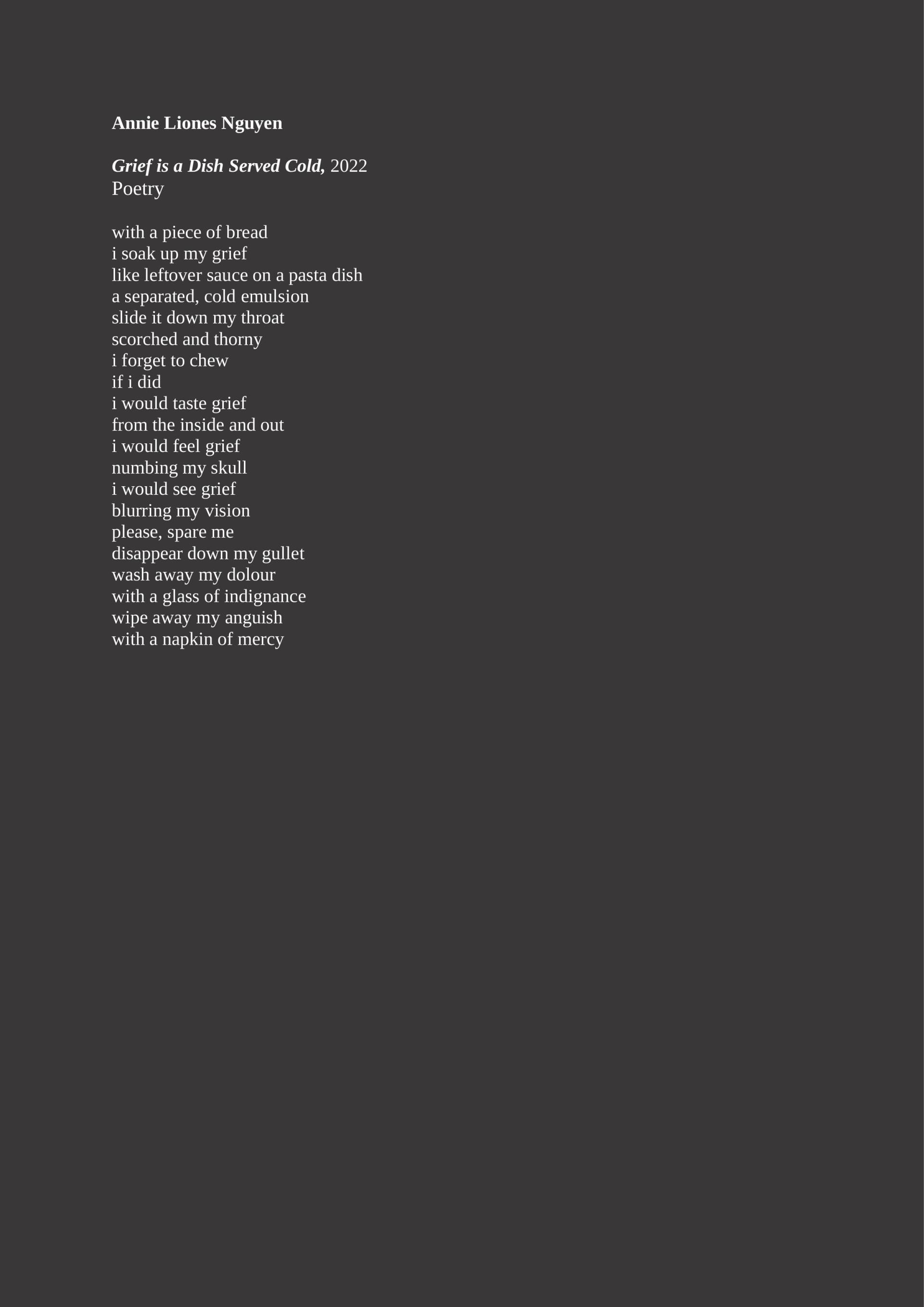
Annie Liones Nguyen, Grief is a Dish Served Cold - Grief is a Dish Served Cold is an imagery of how grief is reimagined as a physical form of a dining experience that is unpleasant. The poet describes the experience as painful to swallow, as well as using other elements on the dinner table to add layers to the experience of grief, or trying to ease the sorrowful feeling, such as a drink and a napkin.
Julia Blochtein, To live is to desire and to desire is to suffer - I like to think that being an artist is a suicidal act, but I do it every day. The desire to create from what I feel, from the incomprehensible, from the inexplicable through words. The daily doubt driven by the current model of society leads me to kill my ego every day, the one that feeds the Will that Schopenhauer talked about, that being an artist is to follow the opposite direction of the Will and to follow the path of pure contemplation, even if this leads to a small escape from the tyranny imposed by rationality. It is therefore my intention to call into question his statement that “to live is to desire and to desire is to suffer”.
Alayla Martin, As You Wish - “As You Wish” is a display of one’s devotion to their higher self, heeding the call of a higher force. Although there is a mischievous smirk, it is not inherently bad. The late congressman John Lewis used the phrase “good trouble”, that is the mission this individual is on. To the right of their eye is a galaxy outline that resembles a feature on the eye of Horus, the mythological Egyptian symbol of protection from malevolent forces. The pink skin, and glowing tribal scarring shows this individual, although with human features it is not just human. My work is to expose others to a world unseen through a modern lense.
Ng Huei Cher, Vermin Witch - She is a witch from the ancient mainland. She bred thousands of bugs and they have to fight within the dark utensil until the last survivor left. They are born to be manipulated and serve their queen, the vermin witch.
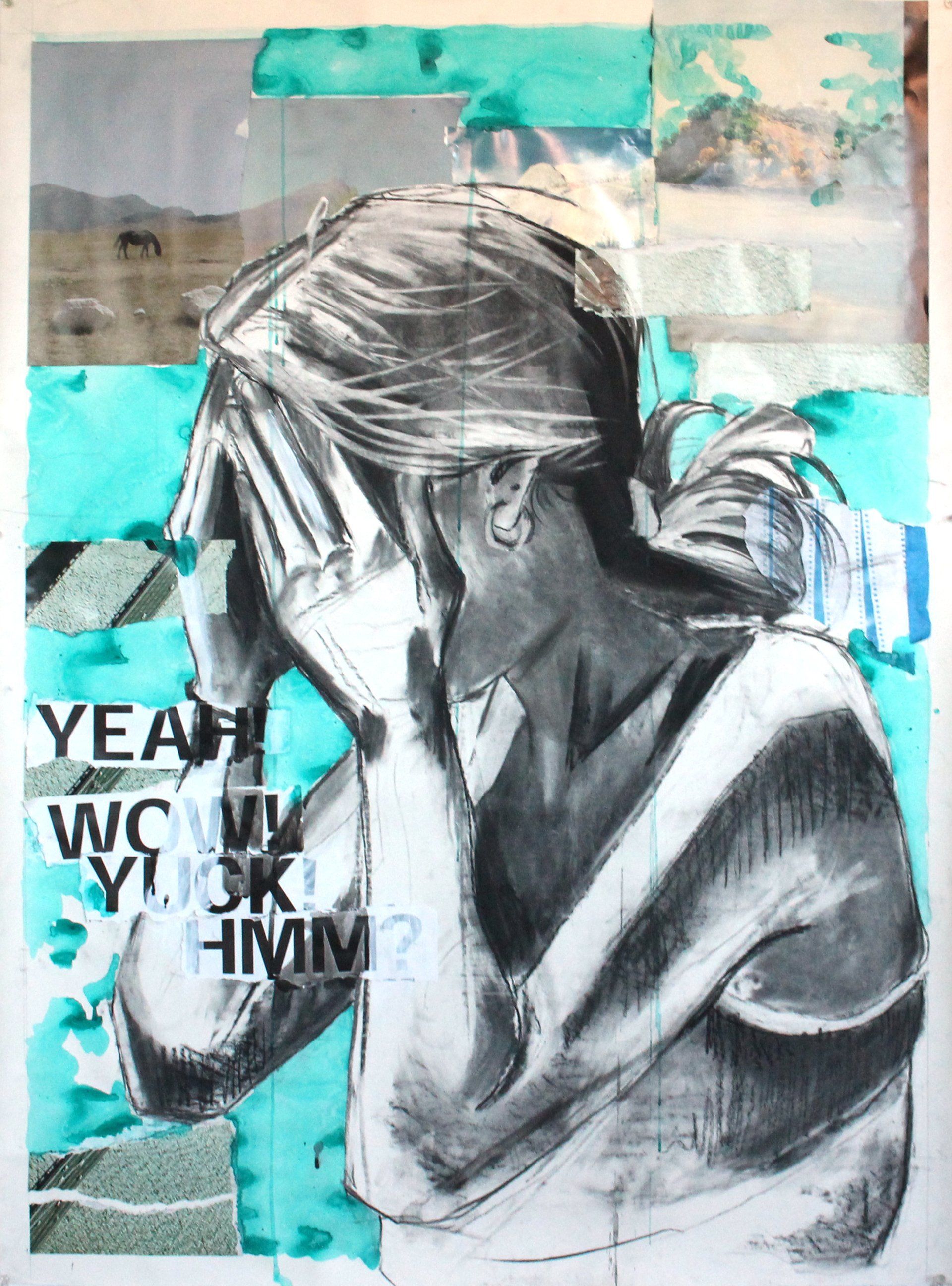
Katie Stewart, Bathwater - Narrative cannot exist in a vacuum, yet this is a common issue in a society regimented by binary and mono perspectives. Katie Stewart collages layers of found objects and photographs taken in different variations and repetitions to reflect the inherent abundance of contexts and natural multiplicity of narrative. Of such a plethora, one image or scene is chosen and recreated with paint, overlaying the mixed media piece, and demonstrating how one idea may be elevated at the expense of others. Automatic writing is incorporated into the work in reference to the fragmentary nature of understanding and association in the human psyche. The concept of our experience of existence itself as collage founds Katie’s practice.
Taya Elizabeth, Florence + Friends - This work was born of an amalgamation of memories from a recent impromptu trip I took to Florence with some friends. The piece, comprised of a combination of charcoal sketches from museums and galleries we visited and drawings of memories and photos captured throughout the week, is layered erratically to echo how I see them and how they make me feel. I wanted to create a visual representation of how the memories exist in my mind - the warmth created from small moments can come together to create something everlasting, bright, and colourful.
Madison Albanese, Residual Salt - I grew up watching home videos and running around with my Strawberry Shortcake 35mm camera. This practice sparked a curiosity within me. It inspires me to document important relationships in my life. The memories recalled upon again and again. I explore the degradation of time and the revival of fleeting moments through media. My work is comprised of portraits based on my photographic archive. I base my curation of these images on composition, direction of gaze, atmospheric qualities, and the emotions the images conjure. I transform these references into mixed media works. I intuitively experiment with mark, and material to discover new relationships within each piece.
Qiyue Zhang, Way back home - “Way back home” depicts me in New York City, living alone in a foreign country. There must be lonely moments, but I hope to find finer things in ordinary life. As an Asian woman, I always feel anxious and unstable. We face some threats in society, and it is also hard for us to become confident. A lot of times, I feel safer in a subway car where I’m alone. We see news every day, and no one wants to be the one who meets the monster on the way home.
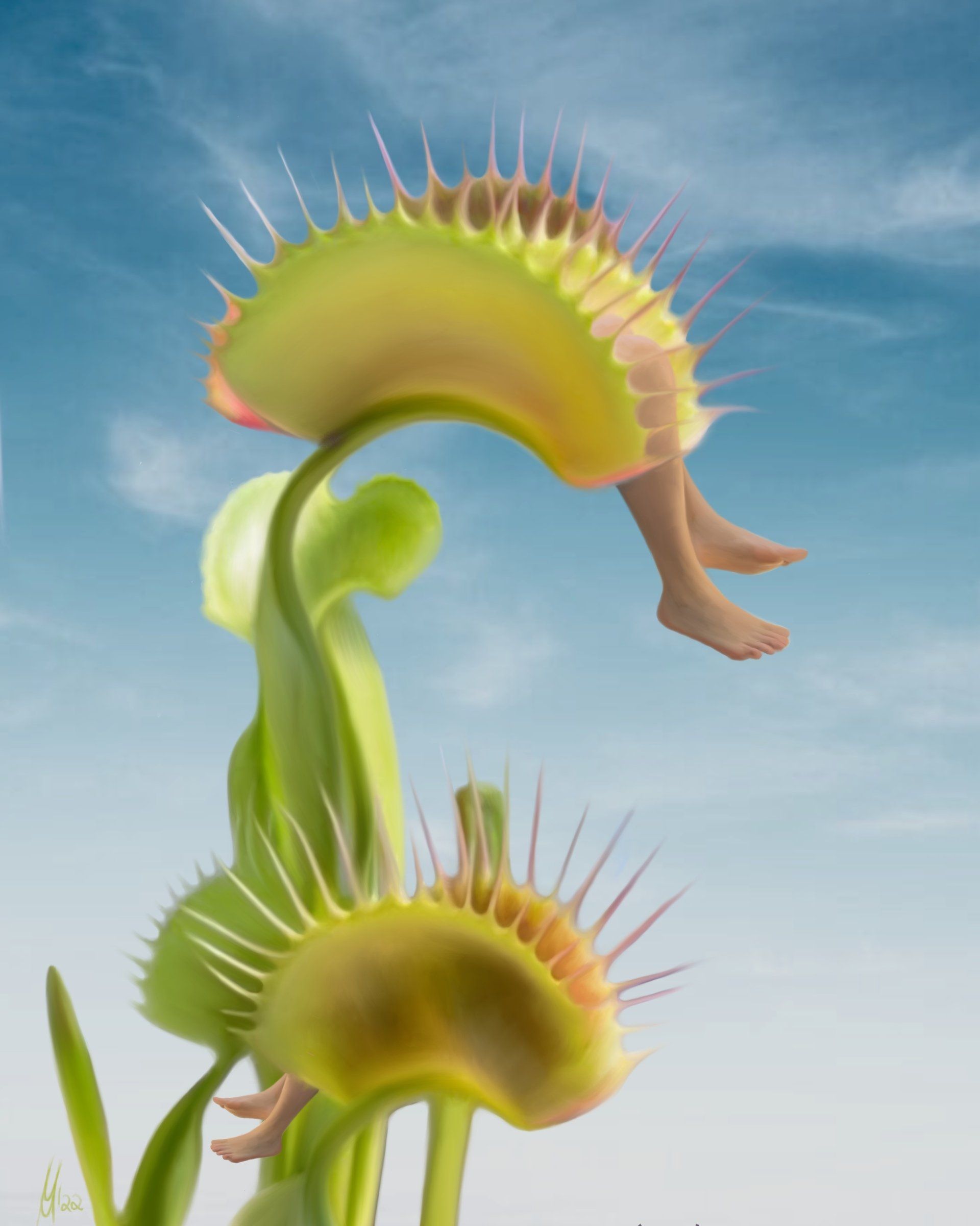
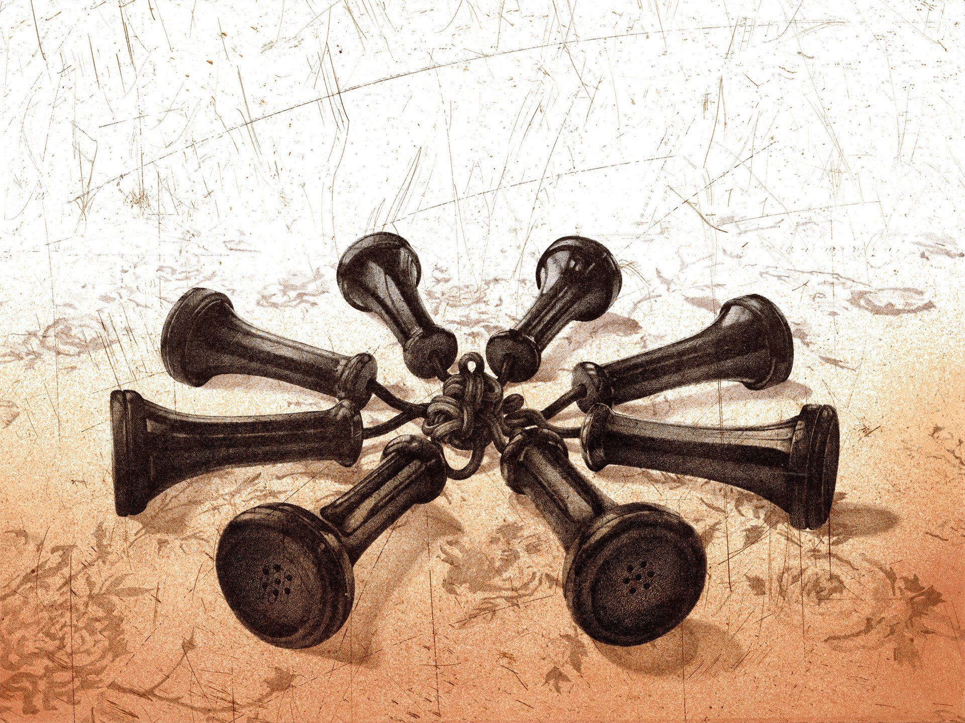
Michelle Mall, Dionaea muscipula - “The Venus flytrap (dionaea muscipula) is a carnivorous plant and belongs to the sundew family. The species occurs only in a very limited distribution area on the east coast of the United States and was first described in 1768. Its fast-moving leaf traps are striking. When stimulated, the Venus flytrap quickly collapses its elaborately constructed trapping blade to catch insects and spiders. The trapping mechanism is one of the fastest movements in the entire plant kingdom, lasting up to 100 milliseconds. The artwork refers to the modern venus, catching men”. The work is a print on high-quality acrylic glass, which is limited to an edition of just 3 pieces. Measurements are 30cm x 40cm.
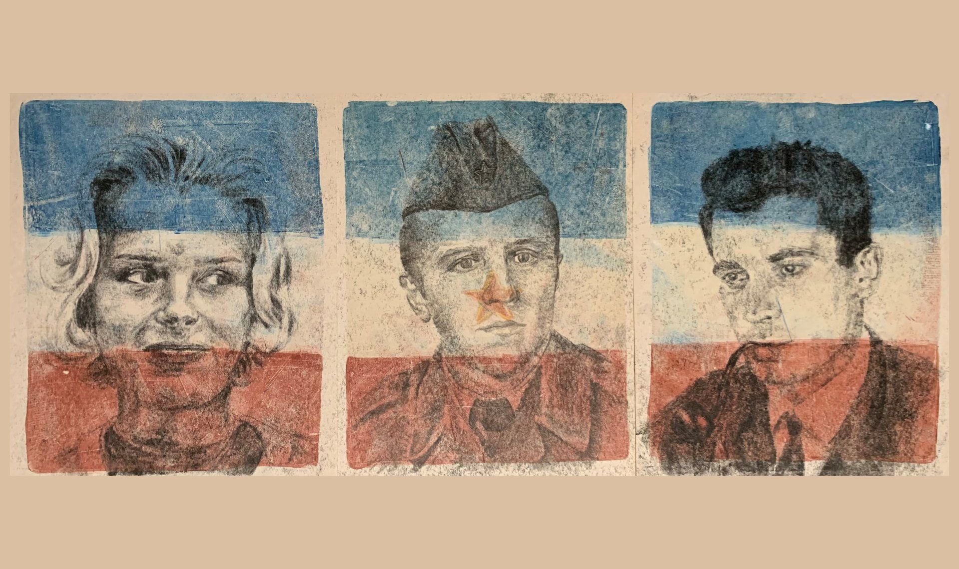
Tara Petrović, Yugoslavia, Through All Eyes But Mine - Though I never had the chance to personally experience Yugoslavia, growing up, I’ve always found myself attracted to the history of it, the culture. Through my family, I’ve been able to hear multiple viewpoints and experiences on the former country. It is a part of me, a part of my history, a part of my family. This work aims to showcase the different people that lived in Yugoslavia— the binding force behind them being the nation itself. From left to right, my grandmother, a professor of latin and french, my great uncle, an active military member, and my grandfather, a doctor.
Nirjona Sadia Enam, Forever in Bloom - Why do we try so hard to prove our worth? Who made this rule that we have to do things in a specific way to prove our strengths? I suppose we forget that we are all on our own journey. Therefore, we are all forever in bloom.
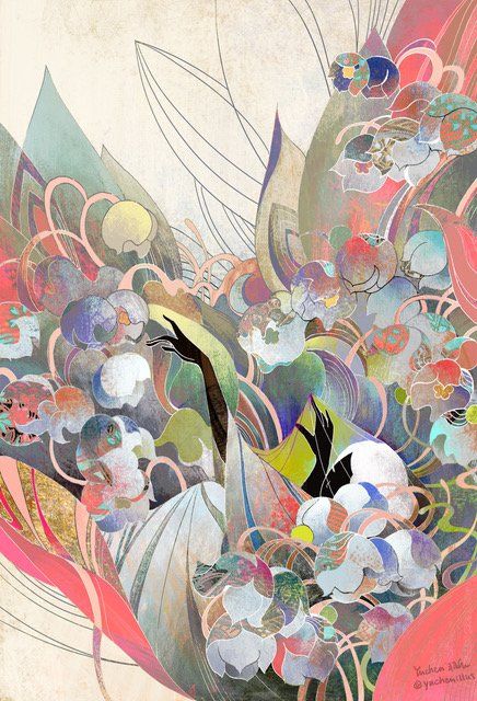
Yuchen Lu, Lilies of the Valley - Originally from Beijing, Yuchen Lu is an illustrator now based in New York. Graduated from School of Visual Arts BFA illustration major class of 2022. She finds inspiration from nature, mythologies, fairytales, and dreams; stemming from a fascination of fantasy since her childhood. Yuchen draws in pen and ink, and then colors each piece digitally. Lilies of the Valley is inspired by the spirit of this flower. Growing in the forlorn bottom of valleys, but strive to flourish…
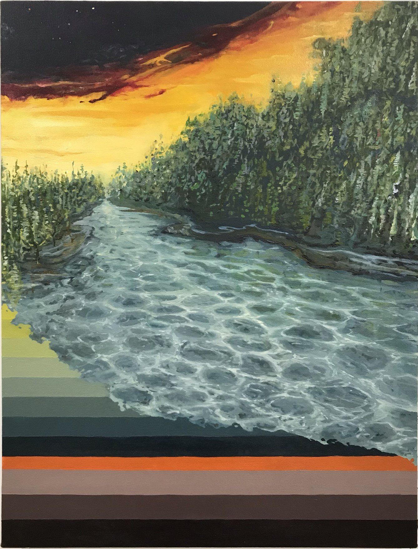
Joel Kurtz, No. 0423 - This piece is a landscape that emerged from my memories of my childhood in British Columbia, which is quite different from where I live now in Brooklyn. I remember running and learning to ride my bike as a little boy, surrounded by the vast and serene evergreens with a river running through them. As I worked on the painting, I stopped thinking about my childhood and began to explore the surreal, the intermingling of the known and unknown, the juxtaposition of the tangible and intangible elements of our world. My art is an exploration of these elements.
Mariia Eremina, PLEASURE - My main inspiration is the astonishing wealth of Nature. Nature gives me freedom and confidence; through its variety of colours and textures, it is a place where I feel safe. The context of my work is focused on environmental issues, climate change and pollution. I also explore mental health of the individual, specifically by considering how colour and nature therapies can improve our physical andmental health. Through my paintings I would like to demonstrate that the fragility of nature is something magical, unique and worth protecting.
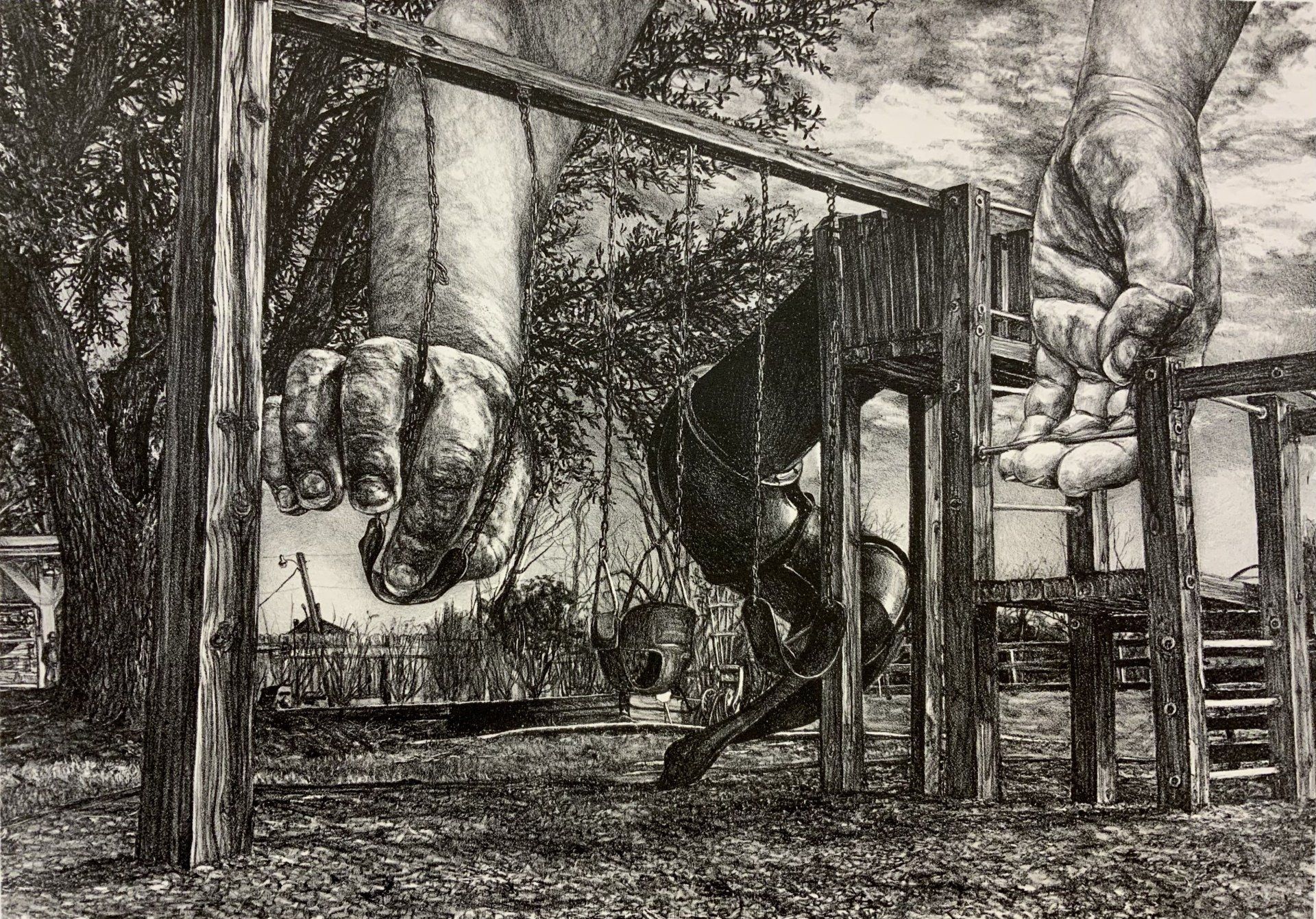
Zoë Couvillion, Higher - Higher is a 15 inch (38.1 cm) by 21.5 inch (54.61 cm) lithograph, drawn on limestone and then printed on Rives BFK in March of 2019. In the image, enormous hands break the stillness of one of my childhood memory scenes. By using surreal hands as metaphor for my own volition, I focus on those things I cannot move or affect in my past experiences, and ask what I can choose to carry forward into my present-day.
Ange Mullins, Earth III - My interest centres around a human, non-human interconnectedness specifically with the natural world. Anthropocentric narratives & socialised habitualisation are gradually being re-evaluated within western communities & I aspire through my practice to augment nature’s vitality & importance, thereby encouraging an increased & mutually symbiotic relationship between us. These interactions are interpreted in my piece Earth III by using foraged earth from Dorset, enhanced with handmade ink made from materials found near my home in Northamptonshire, the combined results feels deceptively simple, much as nature can appear at first glance, but on further inspection offers shape, complexity and tactility.
Eddie Rowe, Explosion 8 - ‘Explosion 8’ is a monotype print from a series of 8 prints that I recently made. I have predominantly been working with monotypes which has enabled me to bridge a gap between the speed of my drawing practice and the fluidity of painting - The ‘Explosion Series’ prints have been made by applying coloured etching ink to aluminum plates and then wiping away from the centre with rags doused in white spirit to erase the image. These prints hope to capture the moment of sheer brightness and piercing impact that is caused by bombs or other explosive phenomena. My work is informed and inspired by global issues such as war, the human-animal relationship and other socio-environmental issues.
Discover More - Instagram: @eddierowe18
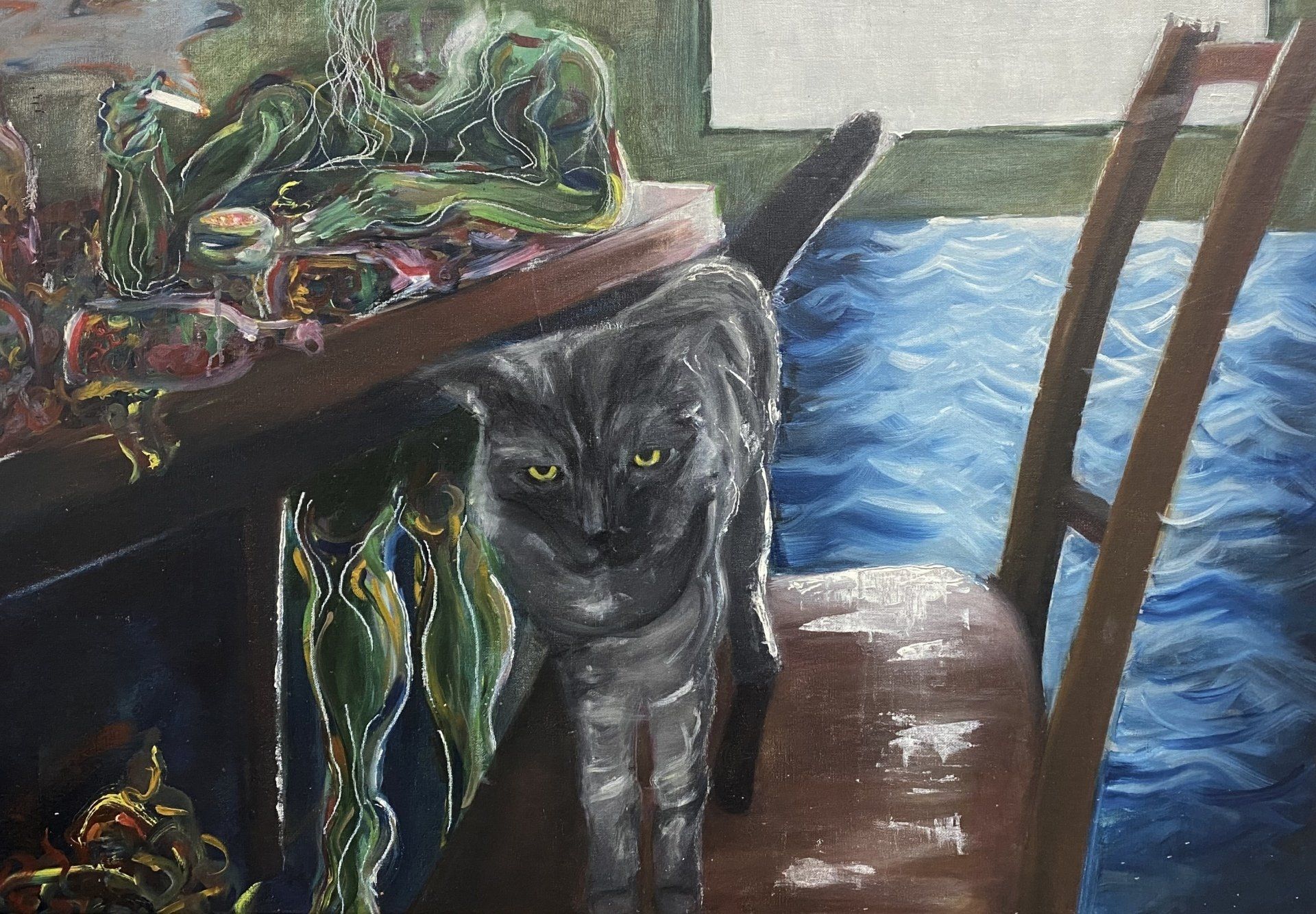
Tan Hui Ru, Wilderness and… - ‘Wilderness and…’ centres around my affection towards my friend’s pet cat and how a cat that wasn’t even my own, was one of my greatest and dearest comrades during a time of personal struggle. Acts as simple as receiving new photographs of him and catching glimpses of what he was doing brought me a sense of joy, comfort, satisfaction and security that I struggle to convey in words but attempt to do so in this piece. This painting was done during my second year at LASALLE. The assignment required us to create two oil paintings using the theme ‘Wilderness and Domesticity’. Ever since then I have considered this piece to be my most genuine work.
Elisa Mouret, Adding and Subtracting - These reference a series of intuitive experiments born on the pages of my sketchbook. They are created through the use of transparent oil sticks and the all over application of wood stain— adding. The subconsciously made lines are revealed by the repelling agent of the oil—subtracting. This is a process not unfamiliar to printmaking but here lies the difference: There are no mistakes, no failures, no control in its birth, only an ache to let the senses take control. Permitting the creation of evidence of intuition, evidence of the subconscious, accidents, porous and non porous, a back and forth—Adding and subtracting and then maybe...more adding.
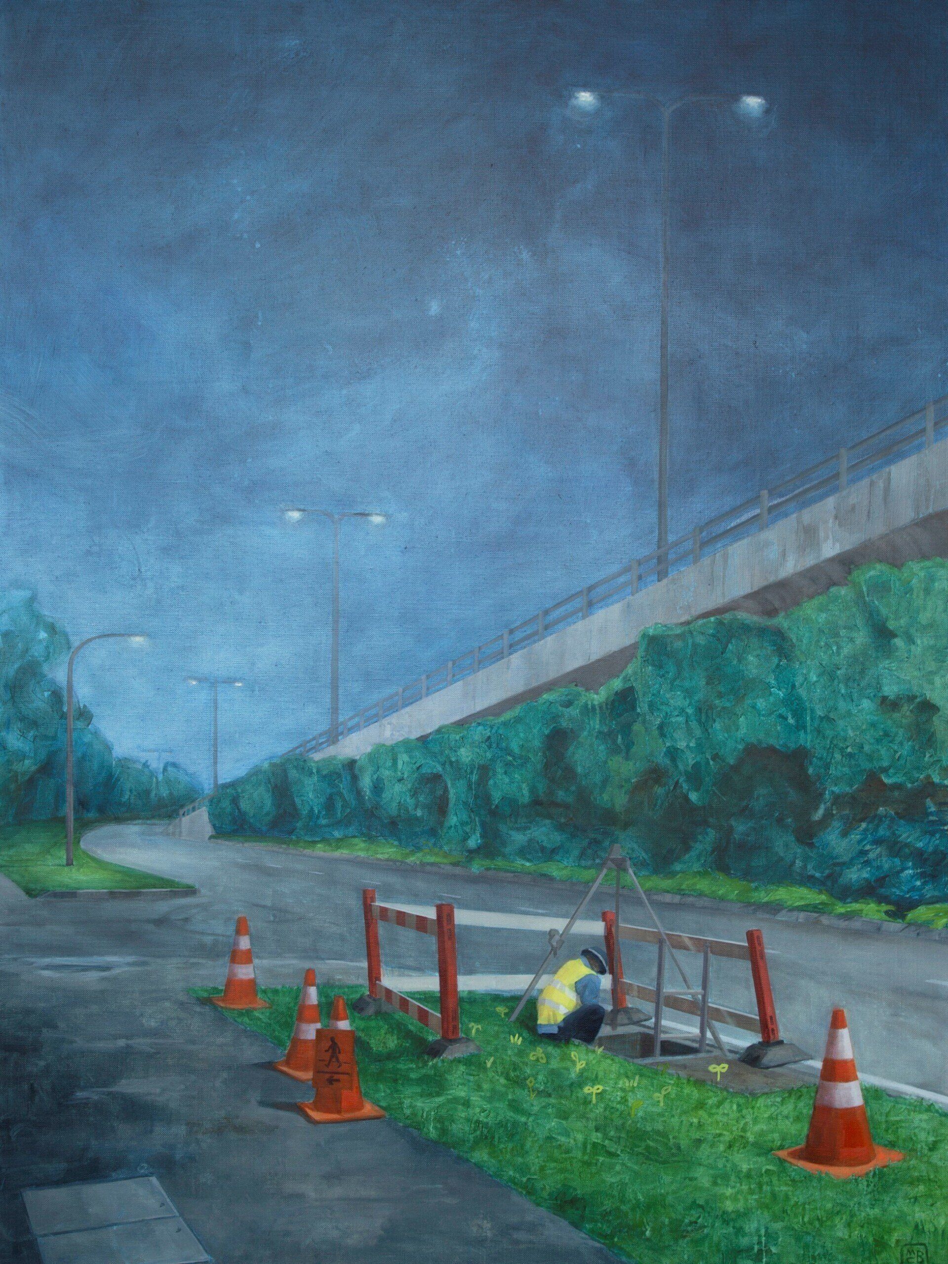
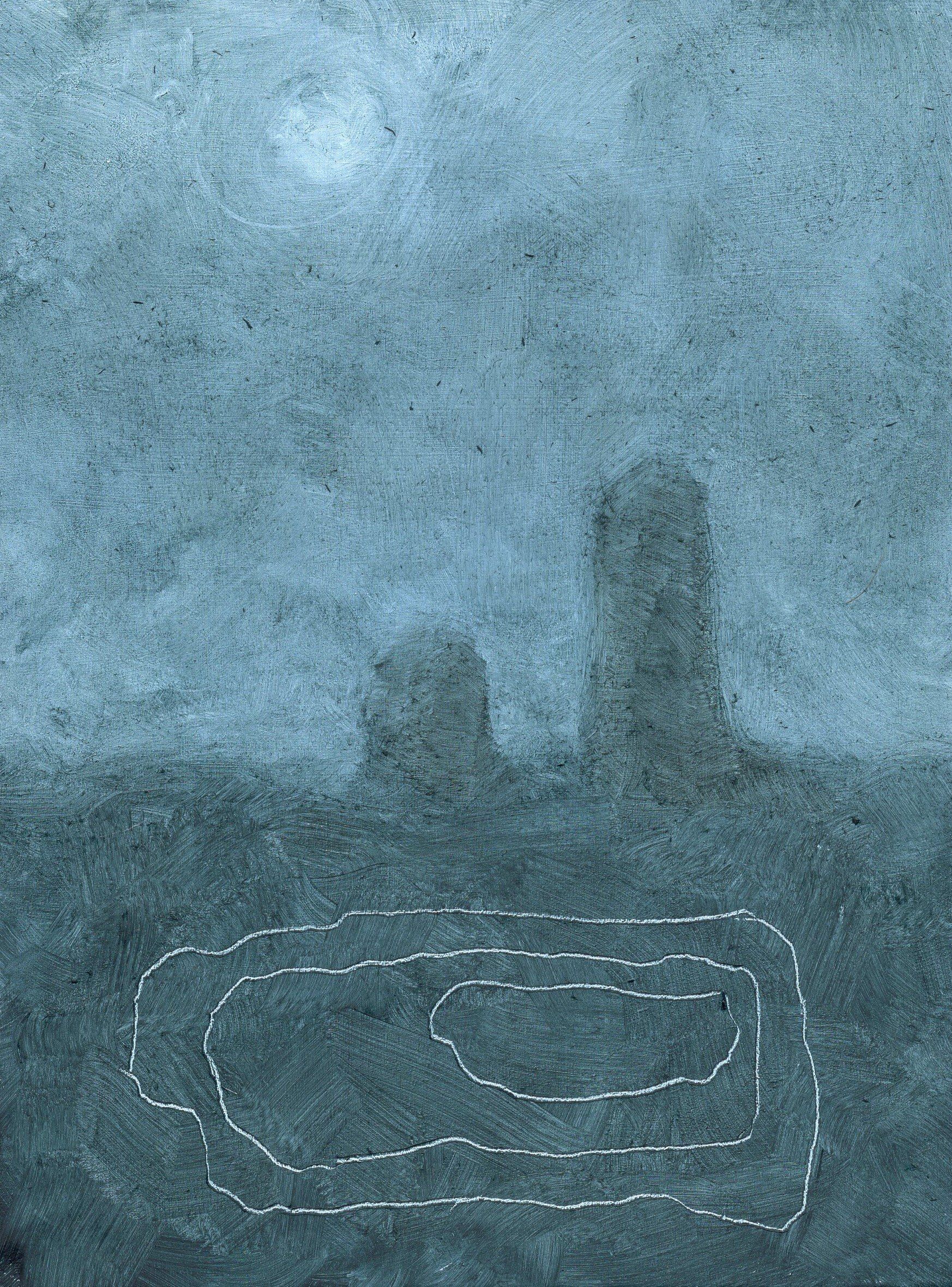
Myrthe Biesheuvel, Nighttime Construction - When the sun goes down, the Singaporean heath gives way to
a cooler night breeze and the buzz of nightlife. People go drinking and shopping and the streets get crowded
and festive. But sometimes construction work continues. Traveling back home at night, I was captured by this
scene of a lonely figure sitting by a hole in the road.
Although the painting has been interpreted in various ways by others, for me it is about finding/creating your
place in the world. I think many artists can relate to this theme and as I’ve been living in various countries,
finding my home has become a central topic in my life.
Myrthe Biesheuvel, Death - This painting is the result of a late evening of experimentation. I was playing with colors, shapes, and textures, on several boards simultaneously, when this image suddenly appeared. I’m excited about the sharp lines which were made by scratching my palette knife into the oil paint layer. I don’t consider ‘Death’ to be a morbid or scary painting, but rather as a painting communicating something very deep, from a faraway place. Its title could just as well be ‘Transition’.
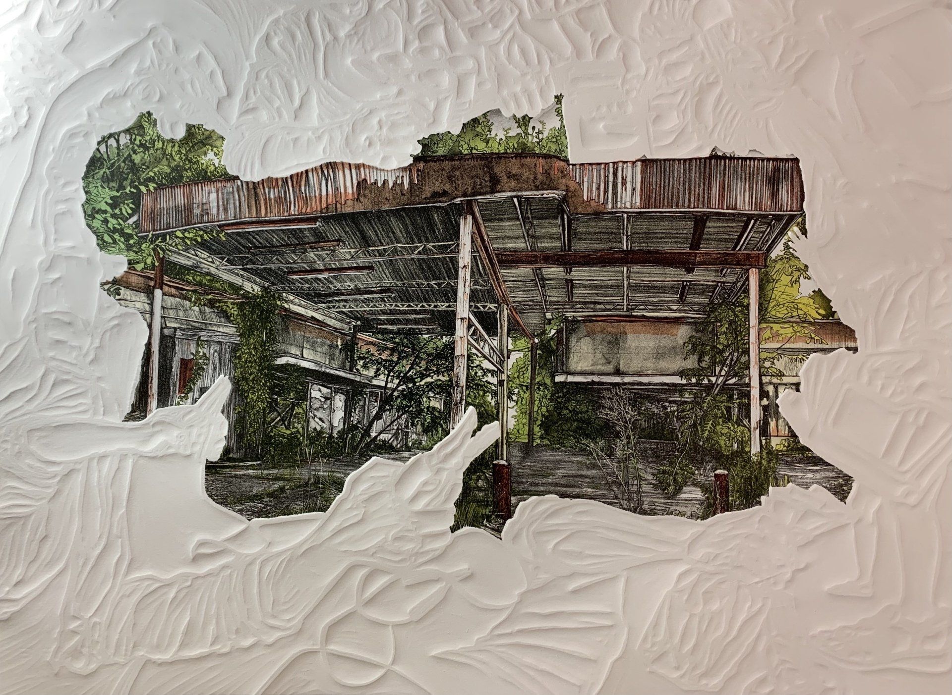
Zoë Couvillion, Jerry’s Last Stop - The central imagery in Jerry’s Last Stop was first drawn onto lithographic limestone, then printed onto Rives BFK in 2021. Hand-carved linoleum was run through a press against the print’s dry paper: creating the work’s surrounding embossment. The final piece reflects an abandoned gas station, and asks what our buildings exist as when people are no longer there to inject them with specific purpose. It measures 22 inches (55.88 cm) by 30 inches (76.2 cm).
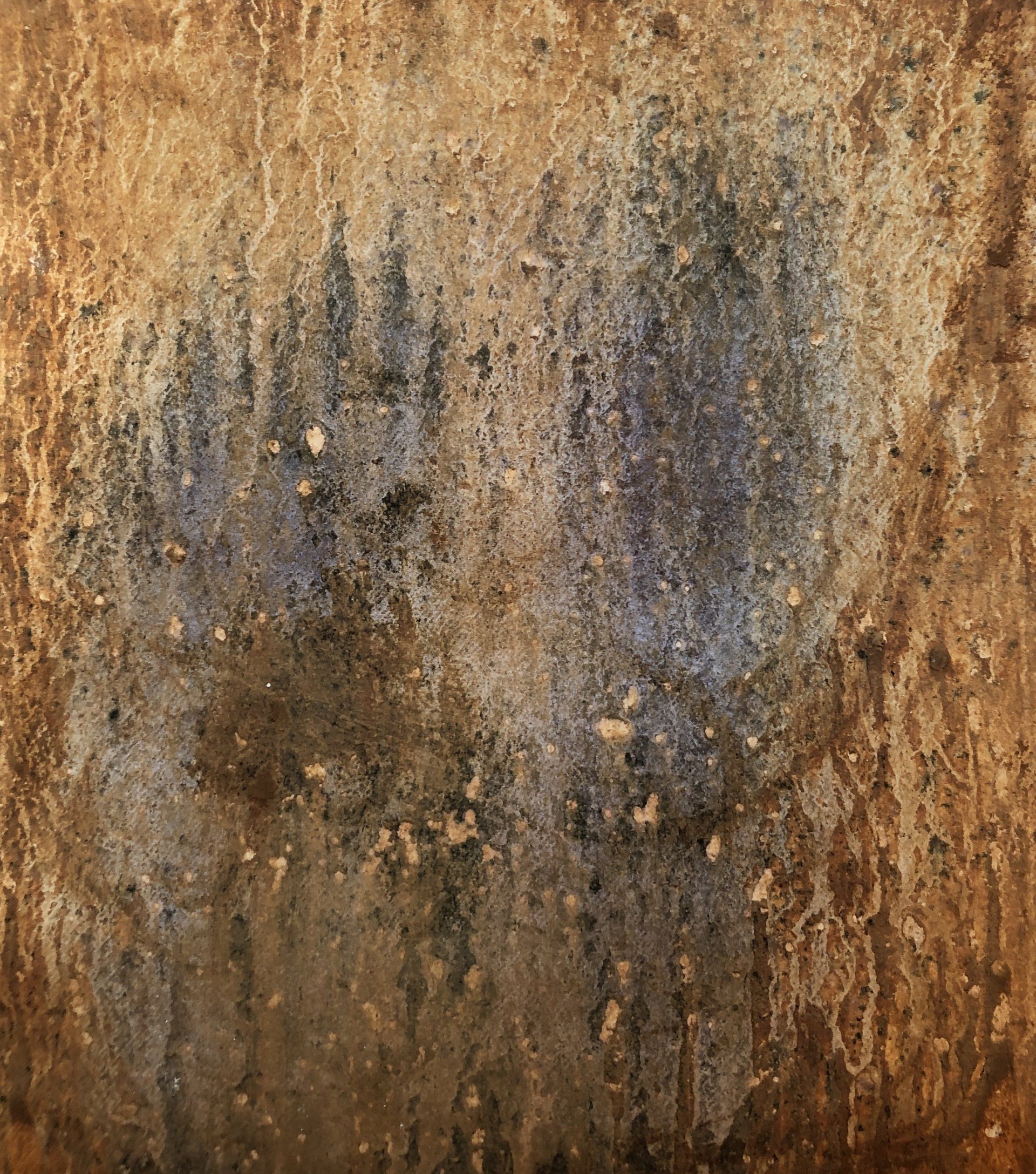
Jacob Taylor Gibson, I Don't Know What's Good for Me (Rat King) - My work draws upon antiquated subjects, patterns, and spaces to illustrate the process of coping with past trauma and the resultant feelings of shame, inadequacy, and incompleteness. Within the images, antique objects are left abject within spaces that are solely defined by aged patterning with the intent of these spaces eliciting familiarity through the use of warm color palettes and worn textures, as an old familial photograph would. Each resulting image serves as dirty looking-glass for the viewer to peer into. These liminal spaces exist neither in the present nor the past; they are somewhere in-between: examinations of how integral past-experiences are in shaping our current selves.
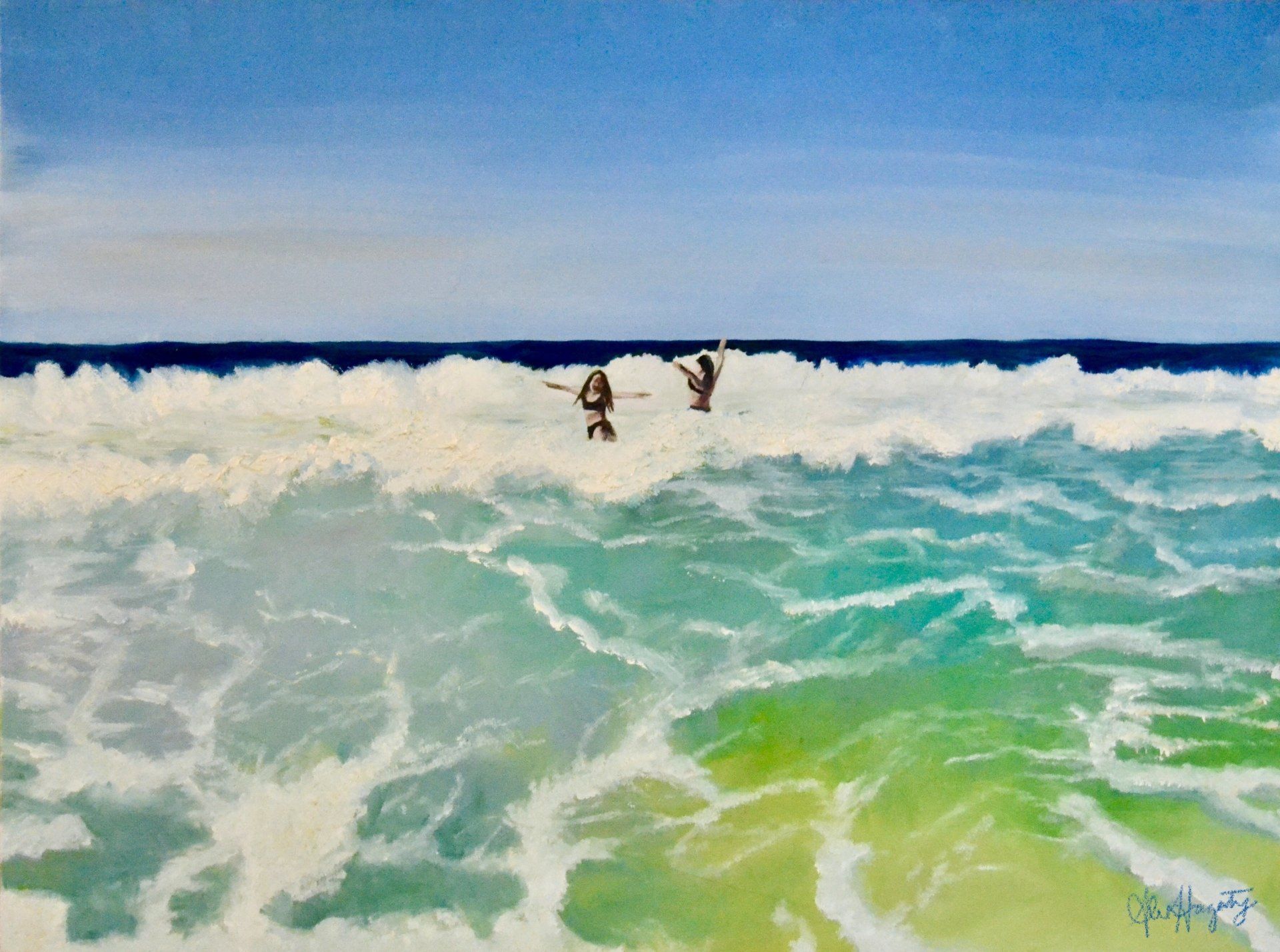
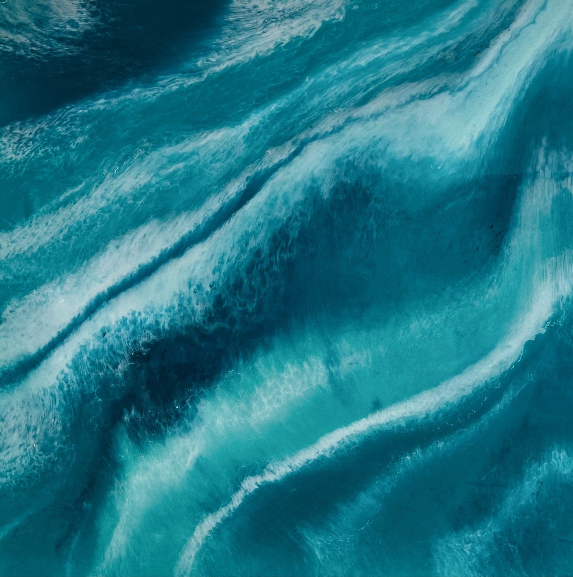
Alex Hagerty, Dancing in the Waves - The ocean connects us to our inner child. As the push and pull of the tide moves our bodies in all directions, the salty wind twists our hair into knots, and the seafoam somehow finds its way into our mouths through gasps of laughter–we no longer have control. We let go. We play. Something a lot of us forget how to do as we grow up. We often grip so tightly onto the things we want, that we forget nature is pushing and pulling us in the right direction every day. When we dance in the waves, it helps us remember the little version of ourselves who knew it would be okay.
Edmund Kerk, Ritual series no. 4 - Edmund (b. 1997) is a multidisciplinary artist who graduated from LASALLE College of the Arts Singapore. His works revolve around the human condition in general. Over the years, he has explored on themes such as rituals, beliefs, emotions, senses, consumerism and technology; where they arise from issues dealing with society, humanity and culture. As his curiosity constantly evolves, he tend to expand on the themes he work on very often, while retaining his identity with the consistent style which characterises
his works — be it techniques, message conveying or storytelling. His works unfold through mediums
such as painting, assemblage, installation and media (photography/videography/digital art).
Discover more from Artist Talk
Click below to find out more about the following - Limited Edition Prints, Previous Issues, Blog and Store
Limited Edition Prints
Artist Talk Magazine is now proud to offer Limited Edition Digitally Signed Prints. Each print will only have 15 copies available and has been digitally signed by the artist. All profits from the sales will go direct to the artist.
Previous Issues
Discover all the past issues produced by Artist Talk Magazine. Starting from Issue 1 - July 2017
Blog
Discover our blog
Store
From our store you can purcahse your open call entry, Magazines and Limited Edition Prints
Say Hi
Send us an email:
grantmilne@artisttalkmagazine.com
Contact Us
We will get back to you as soon as possible.
Please try again later.